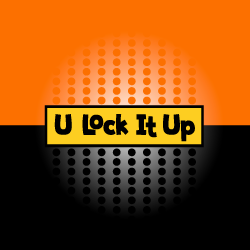
Company Name: U Lock It Up

Description
The designers took a playful route with this typography-based logo for a self-storage facility, and the client loved the results. They started with a whimsical but readable font that balances a modern look with a retro edge. To play off of the name and the concept of “lockingâ€, the designer then created an interlocking layout for the typography. Encased within a thick, black border and filled with a sunny yellow, the final design is eye-catching, fun, modern, and professional.
