Logo design trends to look out for in 2020
October 15th, 2019
A logo isn’t just a small image you add to your website header for the sake of filling in a blank space. A logo is a crucial branding element that helps your business stand out and encompasses in a few pixels the essence of your products and services. Looking back at the history and evolution of logo design, many trends have come and gone and brands have learned to adapt. Now that 2020 is almost here, it’s time to look at the most interesting logo design trends and see how you can revamp your old logo to keep up with competitors.
Adaptive logo design
Like web design, logo design needs to be chosen depending on the device that people use to view your website. According to a TechJury analysis, there will be 2.87 billion smartphone users in 2020. Moreover, 63% of smartphone users have made at least one purchase at their device and use it to interact with brands. Naturally, your logo has to be optimized for mobile users, but does this mean that you should neglect all other platforms? Not at all. Adaptive logo design is one of the trends that marketers have been looking forward to the most, because it allows you to use different versions of a logo, depending on the device of the end-user.
For example, here’s how these famous brands optimize their logo from desktop to mobile:
![]()
Source: diony.co.uk
As you can see, adaptive design isn’t just about resizing the logo and making it smaller. On mobiles, for instance, small logos with a lot of text look are almost impossible to make out, so you need to strategize with your design team and see how you can scale down your logo.
Geometric design styles
Thin, minimal, geometric lines have been a staple of modern web design for several years and, for 2020, we’re expecting to see more of them integrated into logo design as well. Our brain is programmed to identify and understand geometry, so using it for your logo and help you stand out. Although these types of logos may seem basic, there should be a careful creative process to back them up, because every line and shape has a meaning. For example, stars and spirals go well together, and large business or government networks use circles in their logos because they symbolize unity.
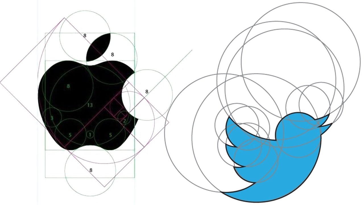
How famous brands used geometry to craft their logos. Source: YouTube
Animated logos
The average consumer has hundreds of online brand interactions every day, so making your logo stand out within the dreaded 9-second attention span isn’t easy. An animated logo can make your refresh your visual identity, capture customers’ interest, and even consolidate your brand. Keep in mind, however, that motion design still needs to respect the ground rules of static design: your animation has to be clean, short, simple, and you shouldn’t exaggerate with effects. After all, it has to represent a brand, not mimic Myspace graphics from the early 2000s. look at these cool animated logos for inspiration.
Playing with perspective
If you don’t like the idea of animated logos, then logos that play with perspective and trick the eye can be another great way to capture people’s interest. Focusing on optical illusions, distortions, and hidden meanings, these logos force the viewer to look twice, which increases the time they interact with your brand and make it easier to remember. However, keep in mind that these logos require a bit more research, especially if they include words and letters and you have an international audience. Even if the trick you used plays well in your local market, it might have an inappropriate connotation for other countries, so make sure you tell your marketing department to investigate and use services like PickWriters where translation is necessary.
Gradients
Instagram was one of the first big companies to use a gradient in their new logo and people weren’t happy with this visual direction at the time. Now, gradients are one of the biggest trends in logo design and, with companies like Firefox joining the bandwagon, we’ll probably see more examples soon. If you like the idea of using gradients, just make sure you work with a professional logo design company, because a quality logo can be harder to execute than you may think, even though it looks basic.
Simplification
If you’ve been in business for years and you already have a good logo that clients recognize, giving it a complete revamp can confuse your audience and dissolve the brand image you’ve worked so hard to build. To give your visual identity a boost and align your brand with the latest marketing trends, you can simplify the logo. This way, you’ll maintain the elements that make your business and get rid of the ones that became obsolete.


