Home> Fundamentals

Should I use a free logo creator or hire a paid logo designer?

September 8th, 2022


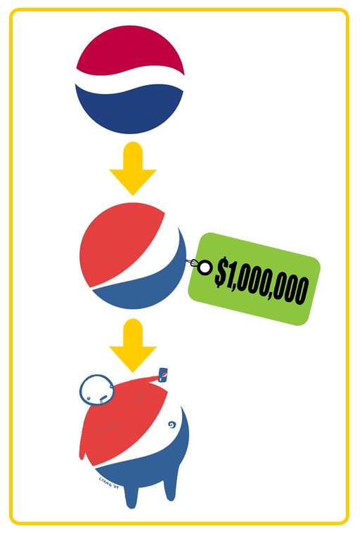
This is one question that can confuse a lot of people looking to get a logo designed for the first time. Even if you are looking to revamp the brand identity design or introduce a new one to the audience, this can be slightly tricky. You want to make sure that the logo is memorable and connects with the viewer in a short time. It’s where the choice between logo creator tool and a paid graphic designer comes in.

Read the rest of this entry »

The Ultimate Guide For Web Design Psychology

December 2nd, 2019

Consistently providing exciting content on your web page is an excellent way to attract regular visitors. However, there are a couple of subliminal elements that need to be used in the web design to boost traffic. These elements are psychological, resulting in the visitors not realizing what keeps attracting them to the site.


To create a visually engaging site that keeps visitors returning, attention needs to be paid to a couple of essential web design areas that will make your website stand out in the already crowded digital landscape. First, let us have an understanding of what web design psychology essentially is.


Web design psychology is getting to know how visitors feel when they visit your site. That is, designing your website in a manner that engages the feelings of visitors either consciously or subconsciously. This understanding helps to improve and positively influence the traffic your website generates.


Read the rest of this entry »

The 14 crucial questions designers should ask a client before creating a logo

September 24th, 2015

Any custom logo design company worth its salt will tell you that the key to creating a successful logo is good communication with the customer. In order to provide the client with a variety of logos to choose from, it is very important for a designer to understand said client’s preferences. The only way to accomplish this is to ask the right questions, such as…

1.       What is the name of your company? This one is obvious enough. Often, the name of the company will play a major role in deciding what will be represented on the logo – sometimes, the name itself is the logo. Even if that is not the case, the name of the company is incorporated into the logo more often than not. Even the simple question of whether the company’s name is long or short plays a major role in deciding the type of logo to be created.

2.       Which words in the company name do you want to emphasize? If the company name consists of multiple words, the client may not wish to give equal billing to all of them, especially since that might make an unnecessarily bloated logo. Some words will be made to stand out while others will be given minimal priority.

Read the rest of this entry »

Why you should change the font you use for emails

August 27th, 2015


Read the rest of this entry »

Parallelism or plagiarism of logo design?

August 5th, 2015

The issue of plagiarism in logo design is one we frequently denounce. But could it be that sometimes the public may be slightly too hasty in accusing a logo creator of plagiarism?

Read the rest of this entry »

Purity Brewing Co Beer logos with a back story

August 3rd, 2015

In the UK room temperature “real ale” has been the drink of choice for bearded old men for centuries. However, in light of the huge craft beer revolution across the pond, it’s now bearded younger men (and women, though less bearded) – of the hipster variety – who can’t get enough of the chilled versions of this traditional beer.

Read the rest of this entry »

Why do colors look different between monitor and print?

July 29th, 2015


Let’s start by analyzing our computer setup. First of all, there are different monitor brands and different video processors. Each comes with its own abilities to reproduce colors and brightness, determined by its hardware. Additionally, there exist all sorts of software setups, such as the monitor’s color mode, the color calibration of your computer and the video card software. This is why colors may look different from one monitor to another.


Read the rest of this entry »

Why start-ups should not worry about getting the logo design right first time

June 12th, 2015

Every single one of the most successful brands in the world has a memorable logo – think of big names like McDonalds, Burger King, Coca Cola, and Apple just for starters.

Your company’s logo is the face of your business, the visual “hook” that helps customers to recognise you, recall what you do, and separate you from your competitors.


Read the rest of this entry »

Pepsi's Logo Mishap

August 8th, 2014

In 2009, Pepsi spent a rumored one million dollars to revamp their logo design. The company was ridiculed in the mainstream media for the exuberant amount of money it spent and insult was added to injury when graphic design artist Lawrence Yang further ridiculed the design by creating a sketch of an obese “Pepsi Man,” highlighting the negative health effects of sugary soft drinks.

Read the rest of this entry »

50 Logo Design Styles And Techniques

November 27th, 2013

There is no one true approach to logo design. A wide variety of design styles and techniques can be employed by designers in their efforts to create a memorable logo. In this article, we try to make an inventory of every different category a logo can fall into. You will notice that style, layout, form, technique and subject elements are all included. Logos typically fall into a combination of these categories - it is virtually impossible to see a logo fall into only one of them. For example, a logo can be a unique font with multicolored letters, a 3D graphic with gradients to spice it up, or an animal drawn in a childlike manner.

Some say that creativity consists in the ability to take several oft-used elements and to arrange them in a whole new way. This is certainly the case in logo design. Even though none of these categories individually is very original on its own, great logo designers will take a few of them and creatively combine them into something unique and outstanding.

1. Separate icon

view source

Read the rest of this entry »

The Three Elements to a Solid Logo Design Plan

May 24th, 2013

By: Deborah Sweeney, CEO of MyCorporation.com

Nearly every small business owner knows how to plan – one of the first steps towards starting your own business is drafting a business plan. But few actually use that skill for anything beyond organizing their workday, or writing a proposal. Jobs like designing a logo really do benefit when the organic, creative process is focused with a plan. But since this is handled a little bit differently than that of a traditional business plan, what elements should be incorporated into a design plan?

Read the rest of this entry »

3 great misconceptions about logo design

April 20th, 2012

I don’t like any of the samples I have received! This company must be terrible!

multiple logo designs

Sometimes you can receive a group of samples that just don’t appeal to you, it happens. Most of the time a client doesn’t know or can’t precisely describe what kind of logo he wants or what image he is looking for. For that reason, a good designer will try to question the client as much as possible regarding their preferences and tastes in logos, but this is not always sufficient. Also note that sometimes an idea may seem good at first thought, but looking at the results on paper you could realize that you don’t like them at all. It is natural to get upset if you have received a package of samples that don’t suit you, but it`s important to understand that since you are not buying a premade product, bad surprises are not impossible nor improbable. Look at a batch of bad initial samples as just another step towards a great final design. It is highly unlikely that you will utterly hate everything about the samples presented. You can pick and combine different elements from them - font, color, object, layout – into one great logo. Even if the samples are really terrible, you could tell the designers precisely what you don’t like about them, which will help them avoid similar mistakes in the next samples. A bad batch of samples, depending on your view of it, can be a glass half empty or a glass half full. It’s a setback, perhaps, but the second round has a much greater chance of success.

Read the rest of this entry »

Logo Guide 2 (Abstract or Identifiable)

April 13th, 2012

logo designs

In this article, I wish to discuss some issues with abstract logo images and identifiable ones. We often get requests from clients asking to create an image that identifies their companies’ business. It is a perfectly proper request. But the client also wants it to be unique, something that no one else is using rather than a common and overused symbol. However, this creates a problem. What do you consider an identifiable symbol? A red cross, in North America, is associated with medical service and ambulance. When you see this symbol you recognize a medical service, despite the fact that it doesn’t show a hospital bed, a doctor treating a patient, or a car driving to a hospital. Most identifiable symbols do not really show the service, yet they are so commonly and often used that they become a standard. Now let’s get back to the client’s request. Take for example a dentist. What are the most common and standard symbols identified with dental health? A tooth and a toothbrush, obviously. When a designer receives a request from a dentist who wants an identifiable logo for his business, but doesn’t want to have overused symbols such as a tooth and a brush, what exactly is the designer to do?

Read the rest of this entry »

Logo Guide 1 (Complexity)

April 9th, 2012

There is a big debate over the complexity of a logo. There are some obvious benefits to simple logos. They are by far the most versatile and easily identifiable. Just look at the logos of Apple, Sony, Honda, Nike, or Guci.
simple logo designs


These logos are easy to reproduce in any size and any color, even black and white. They are easy to embroider or emboss on nearly any apparel or material. These logos are easy to make out from afar and easy to identify.

Not everything about simple logos is so great, though. It is extremely difficult to come up with a new shape and make it interesting. If you look at Nike’s logo, it is not a piece of art per say, but it is a unique shape, which makes the logo timeless and original.

From a client’s point of view paying money for a simple square or half a circle just isn’t worth it. We often hear our clients say: “Well this is not very creative” or “I could have made the same logo myself”. Indeed, simple logos (sometimes just a letter or a simple geometrical shape) just don’t look like much work has gone into them. And yet, take a look at the most famous and recognized logos out there: IBM, JVC, Google, DELL, IKEA...
logo designs


Read the rest of this entry »

What makes a great logo design

March 30th, 2012


1)      The company’s name is the inspiration for a lot of great logos!
What do the logos of Apple, FireFox, Taco Bell, Shell, Puma all have in common?
logo designs


All of these logos include an identifying object directly related to the name. This technique presents its own benefits and challenges. The benefits are obvious: it is very easy to identify the company name just by looking at the symbol and it makes the logo look clever. It also makes it memorable. The challenges come into play if you have a company name similar to that of one already on the market. How do you make your “apple” look different?


2)      There are logos with a recognizable object not associated with the company name.
For instance, Playboy, Starbucks, Lacoste, Bacardi, Michelin, Peugeot...
logo designs


These logos have an identifiable image not related directly to the name of their company. This is really not less effective than the previous way, and many successful companies use this technique. Some of those logos have a hidden meaning or a story behind them, but if you don’t know that story already, it is usually hard to connect the dots: why is there an alligator on a fashion garment, exactly? Others can be related to the enterprise’s field of business. The Michelin Man logo was a great success. Even though it has no story behind it, it does convey the feel of a company producing tires filled with air. Usually, it’s very difficult for a designer to come up with an identifiable image not connected to the company name without getting some kind of story or meaning behind the concept.

Read the rest of this entry »