Chermayeff & Geismar & Haviv
September 6th, 2013
![]()
There is an incredible amount of talent in the world of logo design, so in this blog post I’d like to take a few minutes to celebrate one of my favorite design agencies, other than LogoBee of course!
Chermayeff & Geismar & Haviv is a stalwart in the design and branding industry. Founded by Ivan Chermayeff and Tom Geismar in the late 1950s, and joined by third partner and designer Sagi Haviv in 2006, over the last five decades the company has worked with some of the biggest names on the planet. Their impressive client list includes the likes of Mobil, Xerox, the US Environmental Protection Agency, the Rockerfeller Center, NBC, Time Warner, Merck, National Geographic, and many, many more. To say these guys are in the major league is an understatement!
The company’s ethos is based on the “Modernist principle that design is a problem-solving discipline”. To me, this means that logo and graphic design isn’t just about producing something that looks nice; it is about creating something that has a function and serves a purpose. Creating a logo isn’t just about throwing ideas on paper and hoping your client likes it; it’s about thinking strategically about the design elements that will work for each individual company, taking into account not only what the decision makers find visually appealing, but also what suits their business needs, their client base, their geographic reach, among other factors.
Chermayeff & Geismar & Haviv are so successful not only because they have been around for a long time, but also because they seem to find solutions for each and every problem they are briefed to solve, and they do it “with humor, artistic invention, and an entrepreneurial spirit”. Here are some superb, yet very different examples of the company’s recent work.
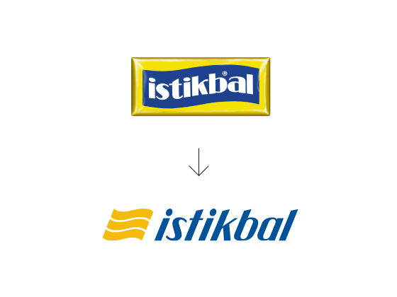
First up is Turkish furniture manufacturer and distributor, Istikbal. Being a global brand with an already well-known logo, the new design needed to be recognizable as the same company, yet bring a fresh, modern twist to the company. Taking inspiration from the waveform of the old logo, the new design is sleek, sophisticated, bold, and very simple. The bright color scheme and smooth lines are just perfect for smaller accents such as corporate stationery or staff uniforms, yet are equally suited to large-scale advertising hoardings or for emblazoning on the side of delivery trucks.
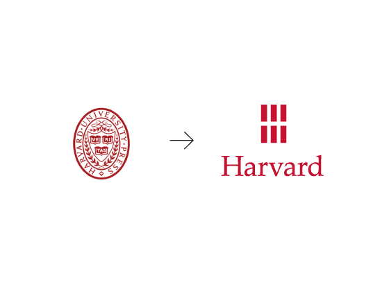
Another effortlessly simple yet visually stunning design is the new logo that Chermayeff & Geismar & Haviv has created for Harvard University Press. Pictured next to the new logo, the old one seems so old-fashioned and fussy that it’s hard to believe it ever existed! I love the way the six rectangles – which represent books – also form almost an optical illusion of a modern letter H, while the typeface remains crisp, elegant, and traditional.

Now for something entirely different. When the Women’s Tennis Federation turned 40, it contacted Chermayeff & Geismar & Haviv for some ideas for an advertising campaign to be launched during the Wimbledon tournament in London, 2013. C & G & H did not disappoint and created an innovative series of photographic advertisements featuring prominent female tennis players from bygone eras, in black and white, offset against color images of modern day players. Here’s one of my favorites, featuring Serena Williams and Billie Jean King. The juxtaposition of color against monochrome shows just how far things have come in women’s tennis – even in women’s sport – while the blurry emphasis on ‘movement’ hints that things are still changing and will continue to get better. I even adore the very simple tagline, 40 Love, which plays on both the tennis scoring system and the significant anniversary of the organization.
About the Author:
Although her primary niche is in scientific writing and editing, freelance writer Lisa Martin is also a creative type with an eye for design. She regularly works alongside graphic designers and as such has a keen interest in the development of logos and branding.


