Coca-Cola Comparable Cans Cause Controversy
May 3rd, 2016
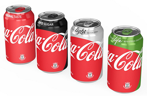
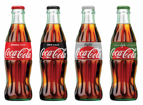
Red is Original. Silver is Diet/Light. Black is Zero Sugar. Green is Life. That’s how it has always been… but soon, it shall no longer be so.
Everyone’s favorite producer of fizzy sugar bombs, Coca-Cola, recently decided to launch a campaign called “One Brand”, the goal of which is to establish “one visual identity system featuring Coca-Cola Red as a unifying color across the trademark.” Aside from the original Coca-Cola cans and bottles, which remain uniformly red, all other flavors will now feature a large red disk which has earned comparisons to the Japanese flag. Coca-Cola also seems to have done away with the distinctive white ribbon which used to be an integral part of the iconic logo.
So far, opinions about the rebrand have been less than positive. Because red is a color associated with full-sugar Coke, the new cans have been described as “confusing” in comparison to the previous designs, which allowed easy identification with just a glance. Qz.com affirms that the campaign is Coca-Cola’s “worst marketing idea since New Coke” – harsh words, considering the disaster that was New Coke for the company.
As it appears on bottles, the red disk has been aptly compared to a rising sun. But is it truly rising… or is it setting instead? What impact will the controversial campaign have on the soft drink supergiant’s future? Leave your opinion in the comments below!
About the Author:
Daniil Stoenko is a professional writer and translator who produced a variety of articles for LogoBee’s Logo Design Blog over the years.


