How simple is too simple in logo design
January 26th, 2017
If you are a fan of tennis, you are probably following the Australian Open, and if so, you may have noticed that just about everyone, aside from Federer, seems to be wearing the same Nike outfit for whatever reason, right down to the sneakers! Not exactly convenient for telling one athlete from the other. How funny that the logo for the tournament should suffer from the exact same issue as well?
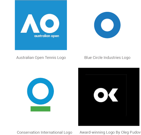
The updated logo of the Australian Open has made very few fans so far. According to a poll conducted by The Huffington Post Australia, 66 percent of respondents prefer the old logo over the new one. The overwhelming opinion is that the replacement simply fails to convey the essence of the tournament as well as the old logo – depicting a tennis player in the glare of the scorching Australian sun – did.
What it lost in power, the logo does not make up for in uniqueness. Virtually this exact same “o” shape has been used by several other logos, and then there’s this award-winning logo by Oleg Pudov, which almost seems like you could rearrange the elements a bit and end up with the Australian Open logo.
Plagiarism? No, this is simply the cost of this simplistic and trendy design. On the one hand, it’s really convenient for just about every format you can imagine. On the other hand, it has been so overused that ideas for new and simple logo shapes are starting to run really scarce. It gets to the point where it’s almost commonplace for multiple companies to have almost the same logo. It does not pose a problem from a trademark standpoint as long as said companies operate in different sectors, but it undermines the iconic nature a logo design should have in order to draw attention.
This plays into the other major issue with simplistic “flat” logos. They may be bold and eye-catching at first glance, but contrarily to more detailed logos, they fail to provide a good representation of the company. This is not only because of the obvious limitations of the style, but also because of its overuse. In the past, different industries would lean towards different logo design styles to stand out amidst the crowd and communicate to their clients what they’re all about with just one glance. In a world where everyone uses the same logo design style, this uniqueness factor in logo design is lost. And perhaps this trend does not pervade logo design alone: again, just look at all these bland and similar outfits on the players…
About the Author:
Daniil Stoenko is a professional writer and translator who produced a variety of articles for LogoBee’s Logo Design Blog over the years.


