LogoBee's Logo Flies to New Heights
October 18th, 2013

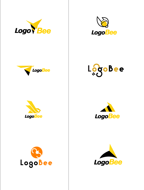
LogoBee has been in the logo design business for many years, but only now have we finally come to the decision of updating our logo. Even though it served us well for over 13 years, we feel that the time has come for us to follow the new design trends and styles. Our designers' objective for this logo was to keep the concept of the flying bee, while also making it look more trendy, polished and timeless. We have taken a minimalistic approach and came up with several renditions.
The new logo has been updated all around. The text has been converted to all lowercase. In addition, the font is much cleaner and thinner than it was in the original logo. The icon is still in the shape of a stylized flying bee, but if you look at it closely, it becomes apparent that it also contains the letters “l” and “b”. The icon has also been moved to the right and separated from the text, which makes the logo more versatile and convenient. The simplified icon also works perfect in black and white, and can be used separately from the text, making it easy to integrate in different types of media. We believe it is a great upgrade from the original logo, and looks much more in tune with the times.
We have also included in this article a few samples that were considered as candidates, but did not quite make the cut. You can thus see the different logo styles that we came up with over the course of the selection process:


