Mind the Gap
October 12th, 2010
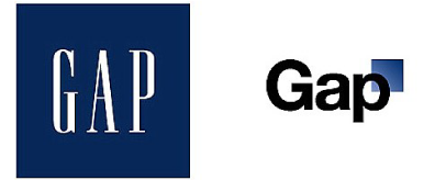
It’s always a risky move for any corporation to change its logo, and when internationally known clothing retailer Gap tried it recently, they soon learned that the customer is always right!
With industry experts suggesting that Gap was feeling out of touch with its client base in these times of economic crisis, a Gap spokesperson said that “after 20 years, it was time for change”. It was out with capital letters and a serif typeface, and in with Helvetica logotype and a blue gradient box design element – to the outcry of graphic designers and members of the public all over the world.
While some embraced the change and hailed the new Gap logo as fresh and modern, others felt that the design looked too simple, too cheap and too similar to the logo of rivals American Apparel. Some even speculated that this rebranding – which came out of the blue with no media build up – was an elaborate publicity stunt intended to get people talking about the brand.
Despite Gap’s initial insistence that the redesigned logo was “part of Gap’s new evolution”, it now seems that they have performed a U-turn and, by popular demand, the old blue and white logo is back. "We've learned a lot in this process” said Marka Hansen, President of Gap North America, “and we are clear that we did not go about this in the right way."
What do you think? Should Gap have embraced their new image, or are you of the opinion that “if it ain’t broke, don’t fix it”? Check out some of the Gap logo samples created by some of the designers at LogoBee.com and give us your feedback!
![]()
![]()
![]()
![]()
![]()


