New logo design for Reebok
March 21st, 2014
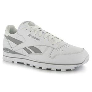
When I was younger, everyone – everyone! – wanted a pair of Reebok Classic running shoes. In fact, this particular model of shoe was quite inappropriate for running and seemed to wear out a little too quickly for my pestered and cash-strapped parents’ liking, but for some reason – along with an Adidias tracksuit, these shoes were all the rage among teenagers in mid-1990’s Britain.
The secret to coolness was to get the shoes (and the tracksuit) in a different colorway to all your friends. While I wasn’t that original with my black and white, head-to-toe Adidias outfit (which was, inexplicably, an adult size XL when I was slender a 14-year old girl), I scored points for my Reeebok Classics which were blue with a white Reebok logo.
Sadly, it seems that the boom in sneaker sales in mid-90’s England hasn’t been enough for Reebok to ride high on sales for the last two decades. Amid reports that the brand is struggling to compete with the likes of Nike and Adidas, it recently announced a change of direction. Moving away from providing products for elite athletes, Reebok is set to focus on equipment and clothing for ‘ordinary’ people taking part in fitness activities.
According to Reebok’s Chief Marketing Officer: “For 30 years we’ve been succesfully makaing products for elite athletes in every imaginable sport, but what we haven’t been able to do is inspire enough people to move.”
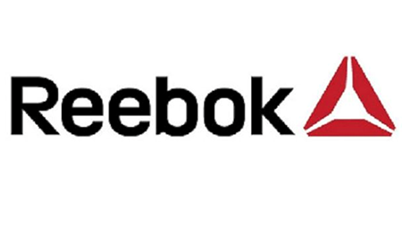
Reebok’s CrossFit range has been around for a little while, and has featured a ‘delta’ symbol in place of the Reebok logo that has become known as “the vector.” Going forwards, this delta mark will be visible on most new Reebok products. “It’s not a logo, it’s a symbol…a way of life,” said the CMO.
What do you think of Reebok’s new look? Do you think it will help to reposition Reebok as a market leader in fitness footwear?
About the Author:
Although her primary niche is in scientific writing and editing, freelance writer Lisa Martin is also a creative type with an eye for design. She regularly works alongside graphic designers and as such has a keen interest in the development of logos and branding.


