Out with the ampersand, in with the plus – Black & Decker logo design becomes Black + Decker
March 7th, 2014
What is the first thing that comes into your mind when you hear the words “Black and Decker”?
For me, and most people, according to a recently commissioned survey, the name conjures up images of drills, electric saws and the classic Black & Decker workmate bench – all branded in trademark orange.
![]()
But no more. Black & Decker – or should I say Black + Decker – recently commissioned design super-agency Lippincott to give the brand a makeover with a modern twist.
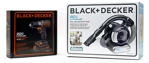
You see, Black + Decker don’t just make power tools and industrial machinery – they also have a whole range of lifestyle products, including a hand vacuum cleaner and a home coffee machine. But the masculine visuals and historically strong association with hand-held tools means that consumers do not connect the brand with homeware items.
Famous for the Coca-Cola swirl and the simplification of Starbucks coffee cups, Lippincott felt that Black + Decker, which was established in 1910, needed to be hauled into the 21st century. First to go was the hexagonal ‘bolt’ graphic, which the agency felt no longer represents the entire range of Black + Decker’s product lines.
Next, in an attempt to simplify the logo, the ampersand was switched out for a minimalist plus sign.
The strength of brand association with the classic orange tone means that this colour will remain integral to Black + Decker’s power tool pallette, but being simpler, the new logo works equally as well in monochrome or other colours, as you can see in the vacuum cleaner packaging example below.
According to Lippincott designer Marc Hohmann, many of Black + Decker’s products were overcomplicated and overdesigned. Working with experienced product designers, the new strategy is “to strip products down to the bare essentials” to create lines that “re-position [Black + decker] as a humble, friendly brand that’s accessible and easy to use.
In line with this thinking, whereas power tools were once manufactured in almost completely orange casings, tools from now on will incorporate orange as an accent colour, rather than the main design.
The range of new-look products, and the Black + Decker website, will roll out shortly and it is hoped there will be renewed consumer interest in the brand.
What do you think of the new look Black + Decker?
Although her primary niche is in scientific writing and editing, freelance writer Lisa Martin is also a creative type with an eye for design. She regularly works alongside graphic designers and as such has a keen interest in the development of logos and branding.


