Top Tips to Create a Logo That Wins Customers Over
August 9th, 2019
Creating a logo is the beginning of building your brand’s identity. Most people mistakenly consider that it’s an easy task. However, making a perfect logo that win customers’ hearts is much more than a fancy font and pretty color combination.
![]()
Image: pexels.com
The world is full of companies and their logos. So, how can you make yourself stand out in this vast competition? Why are some logos easy to forget while others are instantly recognizable even without a brand name? Making the perfect logo requires creative thinking, planning, and knowing the brand. From the very beginning, it’s vital to ensure that the logo presents a clear message to your target audience.
Read this article to learn some of the best tips and practices on how to create a logo design that wins audience's hearts. We have collected six critical steps with a few examples along the way that will help you to create a logo your clients would love.
1. Begin with Your Story
Before you start designing your logo, make sure that you know enough about the brand. It’s essential to understand who your target audience is, what is the mission of the brand, and what is the market.
Think outside of “what your company does”, and think about “why you created your product or service”. For instance, Coca Cola is a carbonated, brown beverage, but we see that drinking Cola is a pure pleasure that we can enjoy every day.
![]()
Image: Coca Cola campaign “Taste the feeling”.
A brand story can create a much stronger connection with your potential clients than a single fact about your business. Furthermore, when it comes to the perfect logo design, it should reflect your brand’s story and personality.
2. Get Inspired
Jumpstart your creativity with some beautiful, fantastic images related to your product or service. The most obvious sources of inspiration, in this case, are design websites such as Behance, Dribbble, or Deviant Art. Designers share their work on these websites searching for followers and feedback.
![]()
Image: Inspiration for Agro-Industry: San Isidro
You should also make sure to observe your surroundings, i.e., your office, team, manufacturing, materials, and more. Who knows when the idea will hit you! Everything related to your brand could be the start of a fantastic logo idea.
Another way to get inspired is to search Thesaurus for some words connected to your product. You will be surprised at how many synonymous of one word there are.
For example, if you own a hair salon, Thesaurus can come up with words like:eyebrow, fiber, fur, grass, haircut, hairstyle, mane, strand, wig, beard, wool, bristle, and coiffure. Find 5-10 words that describe your brand, and use them to help you come up with a relevant concept for a logo.
3. Pick a Color Palette
Once you come up with the proper image, it’s time to choose the proper colorsfor your logo. You can choose one, two, or even three colors for your logo and place them on a perfect, high-contrast background. You should keep in mind that your logo could be put on many different canvases during its lifetime.
Always make sure that your logo works on both light and dark backgrounds. The best thing to do is to create a logo that is versatile enough so that you can change its color, while still keeping it recognizable.
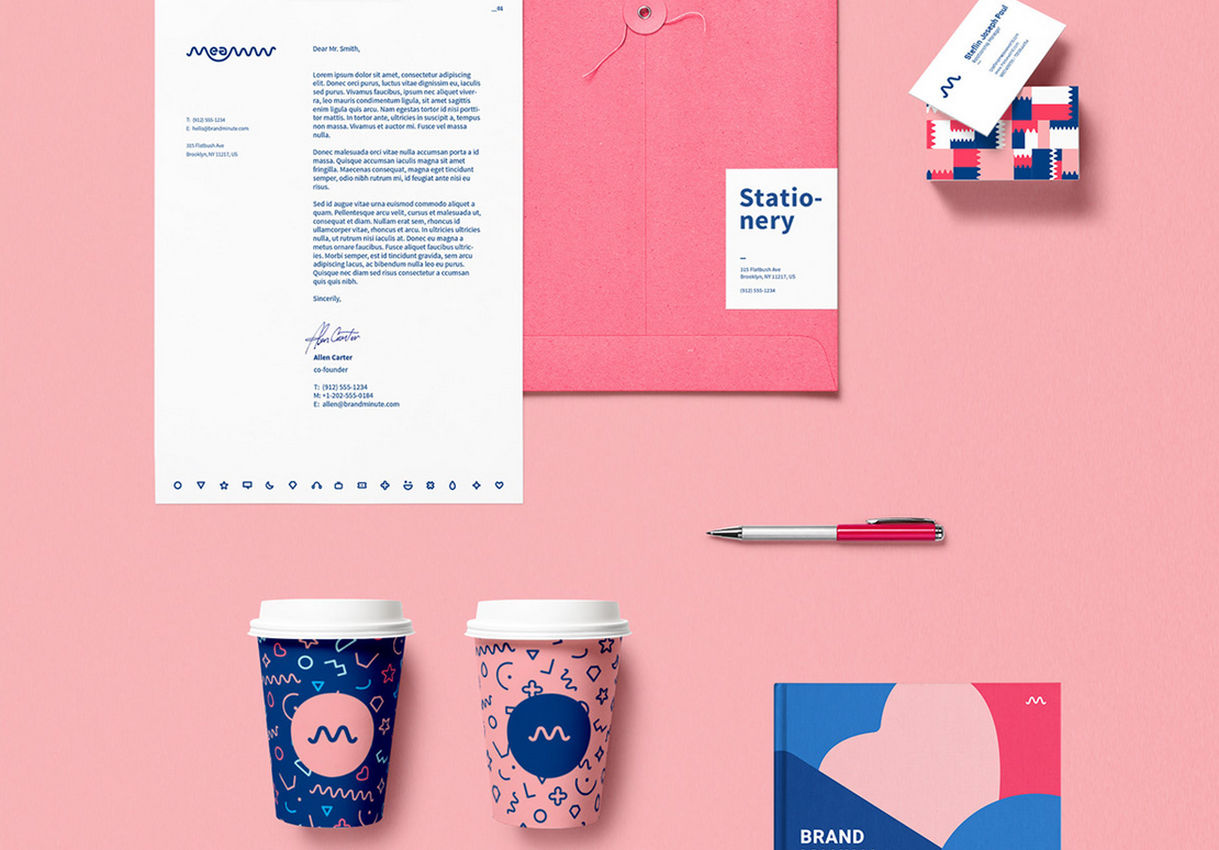
Image: Meaww Rebranding
Place your logo on a coffee mug, a t-shirt, a sticker, or a letterhead to see how it looks on different surfaces. An effective logo employs color psychology and should work in black and white - if your logo is effective, the meaning will be seen even if the color is removed.
4. Choose a Proper Font(s)
Besides choosing the right color and size for your logo, picking a proper font is a way more important choice. In most cases, your logo is image-based, and unless you are Apple, you still need to set your brand name and choose the right font for it.
If your logo has interesting shapes, use a simple serif or sans-serif font that will go along with just about anything.
Similarly, some logos could be designed only with a unique custom font. One of the most famous examples is the Walt Disney logo.
![]()
Image: Wikipedia.org
This logo has been copied numerous times over the years; however, they were all quite awkward.
![]()
Image: Disney logo parody
A custom, handwritten logo would be recognizable and unique, making it a great choice for some logos. Just take a look at this fantastic example of custom font logo from Pello Caffe:
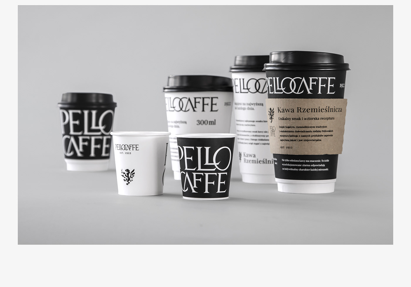
Image: Pello Caffe
For those of you who decided to design your own typography logo, don’t overthink it. Keep it simple, classy, and (most importantly) keep it readable.
5. Remember Negative Space
Don’t forget about negative space when you create your logo. It’s an old trick, but it’s worth remembering. For example, industry leader, FedEx, has won a lot of design awards via their use of negative space. Notice that it hides an arrow between the letters “E” and “X”.
![]()
Image: Wikipedia
Among the other popular logos that have successfully used negative space are Mercedes, NBC, Toblerone, and Adobe. Most companies require a so-called “exclusion zone” which simply means that the area around the logo is not filled with any other elements. Exclusion zone helps to protect the integrity of a logo.
Negative space does not always mean white space - it could be any color. Just make sure that you leave some empty space near your logo elements that keeps the shape or message clear.
Furthermore, negative space helps you to make the logo more versatile. Stay minimalist. With a minimalist approach, you can create focal points and highlight certain elements of your logo.
6. Create a Branding Guide
A logo is an integral part of your branding identity, and you want it to be used consistently along the way. Therefore, you need to have a guide where you specify exactly when and how your logo can be used.
![]()
Image:Behance
In this example from Behance, you can see proper logo use and different variations. You should also make sure to specify how your logo can’t be used.
Usually, designers are creative by nature, and it’s important to show them how your logo is not supposed to be used. So, the next time they choose the wrong size or colors for your logo, you can refer to this guide and that your logo cannot look like this.
Conclusion
Finally, your logo is meant to be presented on many different platforms, including prints, packaging, social media, websites, and across the web as your company grows. Create a logo that will look perfect on either a field-size billboard and a tiny side of a pen. We hope these tips and tricks will help you to build a logo that will stand out from the crowd! Don’t hesitate to share your own logo designs in the comment field below.
Author Bio
Graphic designer by night and writer by day, Cara Thomas thrives in sharing her expertise through fun and engaging content. “Why hate anyone when you can kill them with chocolates” is her motto.


