Verizon new logo design: simple yet effective, or too simple and ineffective?
September 16th, 2015
Though the news was somewhat overshadowed by Google’s new logo launch this week, another big corporation has decided to go for a rebrand.
To mark its $4.4 billion acquisition by AOL, Verizon recently engaged design consultancy Pentegram to come up with a new logo for the telecommunications giant.
![]()
A spokesperson for Verizon said the new logo was “a cleaner, more human design, and the checkmark – the universal symbol for ‘getting things done’, uniquely expresses the reliability of Verizon”.
However, as usual, the Twitterati had something to say, with boss of rival telecoms company T-Mobile kicking things off with the hashtag #NewVerizonLogo:
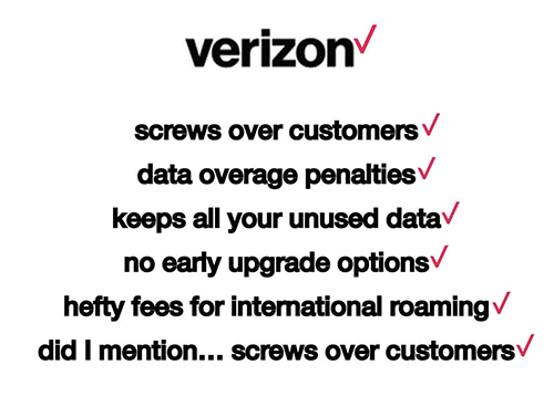
Other designers criticized the new logo for having ‘no emotion’, for the kerning being too close together, and for using the Helvetica font. For others, the logo is simply too simple:
![]()
Personally, I don’t dislike the new logo. It’s simple but, I think, effective. The typeface and colorway are similar to the old logo so clients won’t be confused by the change. And, as we’ve seen many times before, the flattened, blocky color is clearer and easier to read on screens of different sizes and resolutions, compared with the italics and fade-out on the old logo.
What do you think?
About the Author:
Although her primary niche is in scientific writing and editing, freelance writer Lisa Martin is also a creative type with an eye for design. She regularly works alongside graphic designers and as such has a keen interest in the development of logos and branding.


