Pepsi's Logo Mishap
August 8th, 2014
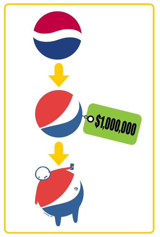
In 2009, Pepsi spent a rumored one million dollars to revamp their logo design. The company was ridiculed in the mainstream media for the exuberant amount of money it spent and insult was added to injury when graphic design artist Lawrence Yang further ridiculed the design by creating a sketch of an obese “Pepsi Man,” highlighting the negative health effects of sugary soft drinks.
In retrospect, was the million dollar facelift worth it? Did the Pepsi logo really need a redesign? Is the prospect of a poorly received logo worth the risk?
These are questions we ask ourselves at LogoBee when re-designing a logo. A common mistake people make when having a logo designed or re-designed is not knowing when they should leave a design alone. Some people believe that more is better but, often times, this is how a design get ruined.
In Pepsi’s case, the new logo was not a complete re-design but only subtle changes to the curves within the logo. The point of the logo was for the white space to look like a smile but it obviously did not work out that way.


