Green Logos
January 10th, 2010
These days, global warming and ecology overall are quite the hot topics and there is no need to say that concern for the environment is a great plus for any company. So how can you show the world your desire to protect the planet? Getting an appropriate logo is one of the ways.
It is far from true that a logo related to nature is not modern. A professional designer can make a “green” logo cool and edgy. The diversity of nature related logos is stunning as well. Below are a few neat examples of plant themed logos:
Trees are obviously a great theme, after all, what says “green” like a tree? As you will see, there is a great many ways to design a tree themed logo. This particular creator went for a realistic approach: the beautiful tree on this logo looks almost as if it was a photo.
This designer went for a simpler drawing style, but as you probably know, simple can be the best. Notice the skyscrapers in the background, which add modernity. This logo blends nature and culture, and shows that the two CAN coexist.

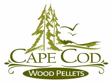
Why content yourself with a tree when you can have many? So thought the creator of this logo. This logo represents a beautiful landscape, a green forest of pine trees, complete with birds soaring in the sky. The art style is simple and conveys a sense of primal peace. It appeals to (pardon the pun) our roots.
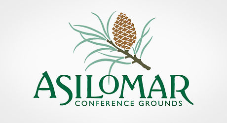
Speaking of pine trees. This logo shows not a whole one, but only a branch with a cone hanging from it. Admire the detailing of the cone, and appreciate the effort that went into drawing such a pattern...
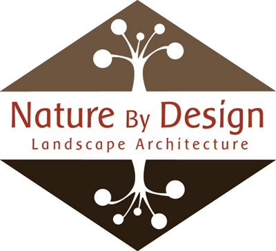
Finally, you can draw a tree in a more... abstract way. The following logo sports a more stylised and modern style. But the shape of the tree is in there, unmistakeable. Again, this logo attempts to blend natural and industrial, which is fitting since it was created for a landscape architecture company, which does exactly that. The two symmetrically opposed trees suggest a duality.
What else says “green”? Leaves. Again, there are different ways to deal with this concept. The following logo is beautiful and modern. The designer played with the colors to obtain some very edgy shading.
The creator of this design used the clover, a widely known plant, in his logo. Again, a simple yet eye-catching symbol.
![]()
Finally, let’s treat another aspect of nature: flowers. This amazing logo represents yet another fusion of natural and industrial that you have already encountered. The left part resembles real petals while the right is more stylized, with abstract entwined curves instead. The logo is definitely looks original and interesting.
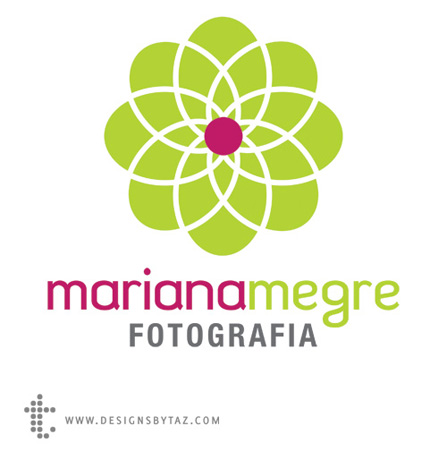
he following logo is to flowers what the fifth one is to trees, simple and stylized. As the company specializes in photography, the flower stands as a metaphor for a diaphragm.
Whether they meld several concepts or accentuate one, whether they are drawn realistically or stylized, these logos are all eye-catching and unique.


