How To Make A Forceful Brand Identity Across The Latest Logo Design Trends
June 17th, 2020
Source: https://images.pexels.com/photos/2235130/pexels-photo-2235130.jpeg?auto=compress&cs=tinysrgb&h=750&w=1260
Creating a brand identity is essential for any new business that wants to eventually grow into a bigger company. But when you are creating your brand identity, you need to keep in mind the latest design trends to assist you with your job. Here is how to make a forceful brand identity across the latest logo design trends.
#1 Time Period
The first thing you need to understand about brand logos is that they usually correspond to the time period they were created in. However, nowadays, it is common to see new brand logos created that are stylized to look like they are actually old. This is done for different reasons, but usually, it becomes a part of the brand identity.
Choosing a different time period for your brand logo is also a way to make your company stand out from the crowd. With so many businesses being created every day and so many already operating, it is very easy to get lost among your competitors. Consequently, developing a forceful brand identity is one of the few ways you can deal with this problem.
When choosing a time period for your brand logo, think about what kind of personality you want your brand to have. For example, if you want your barbershop to feel classy when someone looks at its logo, then you will want to use black and bronze or wooden colors with antique fonts.
#2 Text Logos
Another way to make your logo stand out while also creating a forceful brand identity is by adopting a text logo. Such logos have recently become quite popular thanks to their simple and minimalistic look. Text logos are also usually easier to remember because the viewers remember the name of the company by remembering the way the logo looks.
That being said, there are some things that you should remember if you don’t want to end up with a bad logo design. For starters, it is necessary that you use a readable font. Otherwise, you might discover that your audience doesn’t even understand what your brand is called because they can’t read the text logo.
A good text logo will leave an impression on anyone looking at it just like any other brand logo. Make sure the font you are using can be read while also being different from other fonts used by other companies.
#3 Geometrical Shapes
Geometrical shapes have also become quite popular in brand logo design. They are a form of language that is understood by everyone even if this understanding often happens on a subconscious level. By using certain geometrical shapes, you can show that your company is friendly or bold or reliable or organized or unconventional.
Like using text logos, incorporating geometrical shapes into your brand logo design can make your logo look simple, minimalistic, and easy to remember. Yet, you can use geometrical shapes in your brand logo design without actually using the shapes directly in their simplest form made of thin or thick lines.
For example, you can use an image of a wheel that would represent a circle. Of course, these are all visual images that you should carefully put together in your brand logo in a way that will not make them contradict each other.
#4 Mono Color
A brand logo does not always have to be made of a variety of colors. Instead, consider using mono color. If your brand is connected to exclusivity, uniqueness, originality, and has a target audience of some kind of elite group, using only one color in your brand logo design can help you show that specialness about your brand.
A mono-color brand logo design can also help you save some money in the long run because you will only be using one color of paint for printing your brand logo on different documents (that can be written with the help of a writer from a review site like Online Writers Rating. It might not be a lot, but it does add up gradually. This is especially true for black, white, gray, or black and white designs that let you use only black paint when printing.
Besides, mono-color brand logo designs are easier to remember for your audience and reconstruct by memory. And such a characteristic is always beneficial for a brand logo design that should be remembered by the audience and recognized easier afterward.
#5 Animation
Animated logos are now becoming a little more common though they are still very hard to pull off because logos can’t move most of the time and stay static. After all, they are supposed to be just a picture. But there are certain times when animated logos can be used, so some companies have started switching to animation for more impact.
Animated logos usually have some kind of static form. So, the end result of the animation is usually what the brand logo looks like when it is not possible to animate it. Alternatively, an animated logo can simply be a static logo with a 3D effect, so when there is a possibility to use the animation, it will simply appear to be 3D rather than moving in a certain way.
If you already have a brand logo and you would like to spice it up a bit, animating it with a 3D effect or in some kind of other way can be a good solution because it will make your brand logo look livelier.
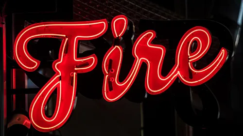
#6 Neon Colors
Neon colors are probably a characteristic of the 80s, but they are quickly reclaiming their spot as some of the most impactful colors to be used in design. Neon colors are bright, energetic, and can attract attention almost instantly making them perfect for brands that have a funky brand image and want to raise interest in their audiences.
That being said, there are some issues with using neon colors in your brand logo design. There is a chance that you might go overboard with neon colors which means they will be more annoying than interesting. If you want to avoid going overboard with neon colors, it is better to use them sparingly or with other complementing colors.
#7 Negative Space
Last but not least, negative spaceis also something that can look pretty good in your brand design logo and can even become a characteristic feature of your brand logo. Artists and designers usually know that negative space, if used right, can create an unusual end result.
Another reason why using negative space in your brand logo design can be an interesting trend to follow is that you won’t have to add new elements, so your logo will stay relatively clean and neat. Fewer elements also means that it is more easily remembered and recognized.
Final Thoughts
To sum up, knowing the latest logo design trends will help you understand how to create your logo design that will shape your brand identity and form what your company stands for and why it is useful for your target audience.
About the Autor

Ana Mayer is a freelance writer who is a qualified specialist in the field of digital marketing. She writes for different news portals and thematic blogs that helps her stay at the heart of the programming and technology news. Such work gives her the opportunity to write articles on the most relevant topics of today.


