New logo design for a new, more serious Mini
August 18th, 2015
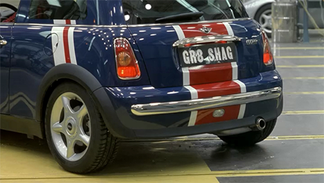
In my mind, the Mini has always been a fun car – quirky, full of personality and always iconic. Think The Italian Job, Austin Powers’ “GR8 SHAG” model, and even Mr Bean’s classic beige number.
Austin Powers drove this 'new' Mini 'shagmobile'

Mr Bean made this yellow Mini famous
But BMW, which owns the Mini brand, has decided to reassess. It seems the ‘compact car’ market has become too crowded, so bosses now wish to focus on the ‘premium compact car’ market. A new Mini Clubman will be launched in 2016.
“This is a serious car that someone like a junior executive could use on a daily basis,” said David Duncan, Vice President of Mini in the Americas.
Along with the new, grown up car design, Mini is also refreshing its logo, moving from the current 3D design to a flat, black and white 2D logo that “eliminates all that is not essential to make room for what matters most”.
![]()
BORING!
What do you think of this shift from fun and quirky to slick and executive? Personally, I’m sad about it and think BMW is sucking the life and personality out of this once iconic automobile. Bring back the third dimension!
About the Author:
Although her primary niche is in scientific writing and editing, freelance writer Lisa Martin is also a creative type with an eye for design. She regularly works alongside graphic designers and as such has a keen interest in the development of logos and branding.


