Pats go out with the old and in with the new
July 8th, 2013
Fans of American Football team the New England Patriots will notice that something has changed about their team’s look recently – the logo.
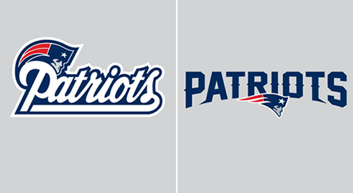
The Patriots’ previous typographical logo was a swirling, old fashioned, blue-edged, white cursive font that has featured on team kit and merchandise since 1993 (see below left). This is now being dropped after 20 years in favor of a fresher, less traditional look for the 2013 season and beyond. The new logo will now feature a bolder, spikier, capitalized block font (below right), though will retain the blue color scheme to ensure some continuity, and while the font has become less curvy, the ‘Patriot’ logo – known to some as the ‘Flying Elvis’ – has become a little more rounded and now appears middle-bottom of the team’s name.

Out with the old and in with the new – New England Patriots change their 20-year old logo (left) for a new look (right)
So why have the New England Patriots decided on this new look? While no official statement about the reasoning behind the new logo has been made, many successful companies, and indeed sports teams, often change up their branding every so often so as to move with the times, and stay modern and relevant to their supporters. Retaining traditional elements, such as the color scheme and, in this case, the logo of ‘Patriot Pat’, helps to consolidate the brand and make it recognizable from year to year.
While it’s generally not recommended for company brand logos to change too often or too drastically so as not to lose recognizability and brand impact, it has some advantages for sports teams such as the New England Patriots who have a large national and international following. To show passionate loyalty to a club, devoted fans often purchase the latest team kit and merchandise, so this logo change will bring about new sales revenue for the team as fans seek to keep up to date.
The boldness of the new logo creates an impression of strength and resilience – something that is not only relevant to the nature of the sport of American Football, but that is also something of particular relevance to the Patriots right now. In the midst of the investigation into tight end Aaron Hernandez, who is currently accused of the murder of Boston Bandits linebacker Odin Lloyd, it is understandable that the team wants to convey a ‘fresh start’, and a new logo seems a good place to start.
Whether you are a Patriots fan or not, what are your thoughts on the New England Patriots’ new logo design? Do you like the bold, striking typeface or did you prefer the more traditional cursive look?
About the Author:
Although her primary niche is in scientific writing and editing, freelance writer Lisa Martin is also a creative type with an eye for design. She regularly works alongside graphic designers and as such has a keen interest in the development of logos and branding.


