Sport Team Logo Design In 2021
July 22nd, 2021
When it comes to a sports team’s branding, the logo is the most critical element. In addition to being at the very heart of brand recognition, it can also help build an audience – or, in the case of a sports team, a fan following. The logo demonstrates a team’s fundamental values and helps set the team apart from the competition, providing supporters with a powerful symbol to identify with and rally around. These logos must be easy to recognize and striking in any format, be it on jerseys and helmets, on and around a sport field or upon the tv screen. Sport teams update their logos frequently to remain up to date and attractive to fans.
With that in mind, let us take a look at some of the logos to have recently been unveiled as teams seek to follow the design trends of this new year. These logo designs may serve you as sources of inspiration in creating your own perfect sports team logo
1. Political correctness is the new name of the game
While teams modifying their logos and company names to remove racist elements and other unfortunate holdovers of years past is not new, this trend has really picked up steam following the advent of the Black Lives Matter movement. It can, however, be a challenge for a team to change its design identity without losing the elements that resonate with its fans.
![]()
The Edmonton Elks is the new name of the CFL team formerly known as the “Edmonton Eskimos”, keeping the iconic initials “EE”. The designers created a modern elk symbol and used the letter “E” from their old logo.
![]()
The New Zealand Crusaders rugby team changed its logo, previously depicting a medieval crusading knight, after the recent tragic mosque shootings. The new logo – a letter “C” in the style of a traditional Maori illustration –ditches the crusader theming and instead plays up the team’s heritage.
2. Let’s get a little wild
Animal-based images remain among the most popular approaches when it comes to creating a sport logo. Animals are commonly associated with extraordinary physical abilities – speed, strength, senses and agility – and represent easy symbols to remember and identify.
![]()
The Citadel Bulldogs college football team has unveiled this new, trendy and streamlined logo, updated from their previous design to keep up with the changing times and distinguish their identity from the many other teams that use the bulldog – an animal famed for its unyielding persistence and tenacity – as a mascot.
![]()
The logo of the South Korea national soccer team has also seen a radical change to keep up with the times, with a simplified, geometric design and bolder colors. The shape of the new tiger face references a football hexagon.
![]()
E-sports teams are not exempt, either. This logo for the Hornets Venom GT, an NBA 2K team based in Charlotte, resembles a simple shield-like geometric emblem, but a closer look reveals it is designed in the shape of a hornet’s head.
![]()
This logo for a Florida soccer team utilizes the image of a heron, a graceful bird well known for its long legs.
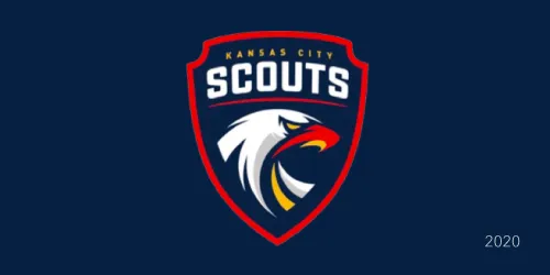
The Kansas City Scouts of the North American Hockey League use the image of a serious and intimidating eagle to show their superiority and cow opponents into submission.
![]()
The Fan Controlled Football League has recently unveiled the logos for its new teams. Designed and chosen by fans like every aspect of the League, the logo of the Glacier Boyz features a cartoonish, but still fierce-looking polar bear mascot.
![]()
This logo was designed for the new Waterdogs lacrosse club, based in Los Angeles. Featuring yet another no-nonsense bulldog mascot, the logo uses the shape of a raindrop to convey the “water” part of the team’s name, and its purple accents and shadows are evocative of a universal sign of danger among marine life, the color of many venomous sea snakes, fish and other sea denizens.
![]()
New logo of the Saint Peter’s Peacocks. The name of this college team references the name of the previous owner of the college grounds, Michael Reyniersz Pauw, whose last name means "peacock" in Dutch. Like the mythical phoenix, the peacock is also considered a symbol of renewal, as it replaces its radiant tail feathers every year – this parallels the way the university came back new and improved after a major fire.
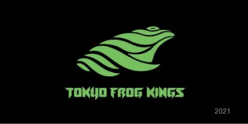
Logo of the new International Swimming League team, the Tokyo Frog Kings. Not noted to be a particularly fierce animal, the frog is nevertheless a fantastic swimmer and an important part of Japanese mythology and culture, considered a lucky animal and a symbol of abundance. To underscore this association with the country’s culture, the font is reminiscent of Japanese characters.
3. Less can be more
Simple things often have the biggest impact, so it should come as no surprise that minimalist logos work well in almost any setting, sports teams included. Many well-known teams, such as the New York Knicks, the Chicago Bulls, and the Brooklyn Nets have minimalist logos. Simple and straightforward, they instantly lodge themselves the audience’s mind without having to sacrifice meaning.
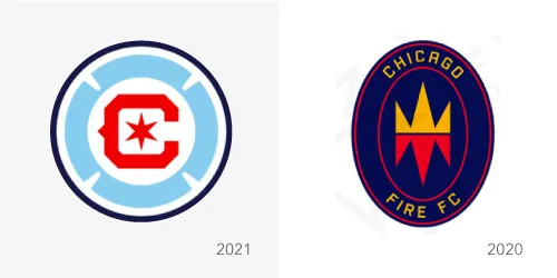
Major league football club Chicago Fire unveiled a new logo for the 2022 season, retiring its previous logo after just one year of use due to massive negative reaction from fans. The new logo has a Florian cross to bring to mind a fire department badge, and the six-pointed star from the Chicago city flag.
![]()
Charlotte’s 49ers college team has changed its 100 years-old logo to a simple black-and-white combination of the city’s initials and a pickaxe. The team’s mascot is the gold miner Norm the Niner, representing the resilience of first settlers. The 180-degree shift in the axe’s position “illustrates the brand’s positive energy and forward momentum”, according to the college’s press release.
![]()
The logo of the Indianapolis Colts has always been simple, but their new logo makes better usage of the team’s name as a graphic design element, whereas it previously was squeezed into an unappealing shape.
4. Chivalry lives on
Crest and coat of arms designs are one of the most popular types of sports logos as they create a bold and powerful statement from first glance, look great in any format (on a uniform, on a playing field, on merchandise, etc.) and harken back to the days of yore, evoking the idea of honorable combat between mighty knights.
![]()
The bold golden letters of FIFA 21’s Team of the Year award logo make it stand out from a dark blue background.
![]()
St. Louis City has a new soccer club, and with it, a new logo.
5. Initial-based logos, simple and impactful
Many sports teams like incorporating the club or the city’s initials into their logo. To the fans, these initials are usually recognizable at first glance, allowing the team to wear its identity on its sleeve, often literally.
![]()
The legendary soccer club Inter Milan simplified its logo removing the letters FC, though not all fans are pleased by the loss of the iconic original look.
![]()
The club has changed its name to Columbus SC and unveiled a new logo in 2021
![]()
Basketball team Sam Houston State Bearkats has revamped its logo, placing the paw print in a more natural position and removing the awkward silvery outline.
![]()
Logo of Ecuador’s football federation (Federación Ecuatoriana de Fútbol, or FEF). The team’s initials are woven together into an intricate crest.
6. Location, location, location
Some logos seek to evoke a feeling of familiarity in the hearts of supporters by representing a city’s signature landmark, sometimes natural, sometimes manmade.
![]()
Women’s basketball team the Seattle Storm has launched a new logo, retaining its iconic image of the Space Needle. Instead of a cloud, the “storm” part of the name is now represented by a simple lightning bolt.
7. A matter of pride
Patriotism has always been an important element of sports logos – after all, most people will cheer for their country or city’s team during sporting events. It is therefore unsurprising to see logos that evoke elements of their teams’ national identity. While the old Stars and Stripes is a perennial favorite in the US, as is the maple leaf in Canada, other cities and countries also like to get in on the action.
![]()
The New England Revolution has redesigned itslogo, previously evoking the iconic US stars and stripes, to an elegant shape reminiscent of both a rose, an official seal used on documents, and a cockade worn by the United States’ forefathers during the American Revolution.
![]()
Logo of Austria’s national soccer team for Euro 2021, which combines the country’s flag with a crest in the shape of an eagle, reminiscent of the its official coat of arms.
![]()
Unveiled in 2021, this logo for a new hockey team based in Trois-Rivieres, a city in the province of Quebec, smartly combines a powerful lion image with a fleur de lis, a symbol prominently featured on the province’s flag and symbolizing its French roots. Interestingly, the team’s name serves as a historical call-back to the hockey team of the same name that made its home in Trois-Rivieres from 1955 to 1960.
![]()
In addition to featuring a shark, an apex aquatic predator that makes a fitting mascot for a team based in an island country, the new logo of Cape Verde Football Federation sports the colors of Cape Verde’s national flag, making a powerful patriotic statement.
8. Sometimes, all you need to do is go back to your roots…
The world is changing fast, and with it, logos are changing too, becoming ever more stylized and sleek to fit the needs of a fast-paced business context. It can be comforting to know that even in this ever-shifting reality, there can still be a place for designs harkening back to the “good old times”.
![]()
The iconic football-shaped vessel of the Toronto Argonauts Logo is back after being retired for about 15 years – revamped, but no less recognizable.
![]()
The new logo of the LA Rams uses a simple and modern graphic in the shape of a ram’s horns… what you may not know is that this design harkens back to their very first logo created all the way back in 1983! Sometimes, the more things change, the more they stay the same.
![]()
The Milwaukee Brewers came back to a remastered version of their old logo – a baseball glove in the shape of a letter M.
![]() They have also redesigned their alternative logo, harkening back to their very first logo in 1970 – a mascot evocative of a barrel.
They have also redesigned their alternative logo, harkening back to their very first logo in 1970 – a mascot evocative of a barrel.
9. Myths and legends – ancient, but not forgotten
Even in an age of logic and reason, myths, legends and other folkloric elements still have the capability to fascinate us. Many legendary creatures and figures have become potent symbols of power, cunning, etc., and therefore it should not come as a surprise that sports teams tend to utilize them in their logos.
![]()
Logo of the new hockey team Seattle Kraken, named after a legendary sea monster. The city’s initial is combined with a suckered tentacle and an ominous red eye.
![]()
Another logo from the Fan Controlled Football League: the Beasts have chosen for their mascot this fierce creature resembling a dragon.
![]()
Iceland’s national football team’s logo has seen a drastic change and now represents the “four guardians of Iceland” from ancient folklore – a bull, a giant, a dragon and an eagle, the four of them coming together into the shape of a snowflake. This modular logo is very clever and has a lot of meaning, but is quite “busy” and difficult to make heads and tails of at first glance, a drawback for a sports team logo.
![]()
The E-sports team Ninjas in Pyjamas has changed its shuriken-shaped logo to a simpler, bolder and more impactful shape. Ninjas hold a special place in the public consciousness – over decades, tales and legends have turned these assassins into mysterious figures endowed with almost superhuman agility and stealth.
10. Feel the thrill
Sports bring together passionate fans and tends to evoke strong emotions and reactions in both participants and members of the audience. It is no surprise, then, that an exhilarating and thrilling aesthetic is a common theme in sports logos. With sharp edges and contrasting colors, these logos depict the rush of adrenaline associated with sports.
![]()
This logo designed for Oregon’s new professional indoor football team High Desert Storm makes an immediate impact with its bold chrome font and the striking image of a tornado.
![]()
Another logo from the Fan Controlled Football League. This time, it’s the Zappers, who went with a simple, but impactful image – a bolt of lightning, a universal statement for speed and power, striking through the center of the team’s initial, with a powerful golden font standing out from its black banner.
11. Vintage logos: old but gold
Harkening back to the past, vintage logos seek to invoke a sense of nostalgia for the “good old days”. Such logos are often favored by teams and clubs with a rich and treasured history for the fans to reminisce fondly upon.
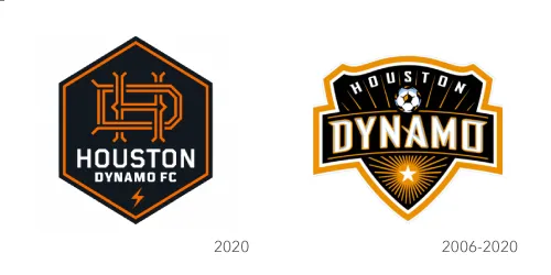
Houston Dynamo’s new old-timey logo effectively combines the team’s initials with the idea of electric wires and may also call to mind a classic light-up sign. A small lighting bolt badge below the team’s name completes the association with electricity, fitting for a metropolis known as "The Energy Capital of the World".
![]()
With its stylized small white clouds and its popping 3D font, MLB’s Spring Training logo looks like it popped right out of a 40es billboard or post card.
12. In good shape…
A plain sphere or triangle may seem bland and boring at first glance, but when different geometrical shapes are combined and layered, intelligently colored with varying shades, they give an illusion of structure and depth. Like minimalist logos, geometrical logos are extremely useful in the sports industry for their ability to convey feelings and emotions at the very first glance. A classic example of a geometric sports logo is the Olympic rings.
![]()
Logo of the new International Swimming League team, the Toronto Titans.
![]()
The Los Angeles Chargers logo saw a slight redesign in 2020 to change its font and make its lightning bolt shape more appealing.
13. Illustration-based logos still have their place
Illustration-style logos – literal depictions of an object, a mascot, etc. – are a classic of sports logo design. With the advent of the new generation of logo design bringing about simpler styles, illustration logos have fallen out of favor compared to their prevalence in the early days of design, but they remain prevalent among sports teams for their classic allure.
![]()
Every successful hockey team needs a farm club to raise new stars, just like every knight needs a valiant steed – so it is perhaps no surprise that the logo of the Henderson Silver Knights, farm club of the new NHL team the Vegas Golden Knights, depicts a fierce warhorse wearing silvery horse armor.
![]()
Another fan-designed logo from the Fan Controlled Football League. the Beasts have chosen for their mascot this fierce creature resembling a dragon. Not bothering with savage beasts like their competitors did, the Aces opted for a simple profile image of a bearded man among men, wearing a headband and pink sunglasses. Why pink? Because only real men can remain manly in pink sunglasses, everyone knows that.
14. The seal of approval
Seals have been used throughout history to assert authority. Much like logos resembling shields and crests, seal logos have an upscale and elegant feeling, with a subdued sense of power subtler, but no less impactful than the one radiating from aggressive-looking mascots.
![]()
The Montreal Alouettes have retired their iconic “angry bird” mascot, building their new logo around a symbol that evokes the letter M, a lark (the English meaning of the team’s French name), and a plane (Bombardier, an aviation company considered as the pride of Montreal).
15. A cursive upon thee
One of the simplest logo approaches, it tends to give a sense of elegance to the company. In sports, this style is used for its simplicity, as it is easy to read and lends itself well to being put on merchandise and uniforms.
![]()
The Citadel college team dropped its graphical elements outright and created a woodmark-style logo using a customized cursive font with an appealing vintage look.
As you can see, there are many concepts that can go into creating a sports logo. At Logobee, we can use any of them to create the perfect logo for your sports club or organization – one that looks modern and trendy and conveys the right message. To get a logo designed by us, give us a call at 1-888-905-6462 or contact us online.


