Hootie gets a makeover
July 24th, 2013
A travesty to feminism, or harmless fun? Love it or hate it, whatever your view, there’s no denying that the Hooters chain of restaurants is certainly iconic. The great-tasting chicken wings, the cold beer on tap, the warm and friendly atmosphere – oh yes, and the Hooters Girls with their skimpy orange shorts and tight white t-shirts!

Feeling the heat from other rival ‘breastaurant’ chains such as The Tilted Kilt and Twin Peaks, Hooters announced earlier this year that it would be rolling out a remodel of every Hooters restaurant over the next few years to install increased outdoor seating, more large-screen TVs for sports fans, and an extended menu featuring healthier alternative options and fresh, rather than frozen, meat products.
But that’s not all. Hooters has, for the first time in 30 years, decided to update the legendary logo that features on all Hooters Girls’ uniforms (not that customers are really interested in the logo when looking at a Hooters Girl’s shirt…).
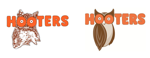
Moving with the times, Hooters’ marketing department felt that modernization was in order yet, says chief marketing officer Dave Henninger, “We want to keep the tongue-in-cheek wink going”. Retaining the bright, bold orange font that is emblazoned across the Hooters Girls’ chests, the new logo design (above right) still presents the observer with the visual euphemism of Hootie the Owl’s eyes doubling as the other kind of ‘hooters’.
The main change to the design is to Hootie the Owl himself. Gone is the line drawing representation of Hootie that, rumor has it, was originally traced from the pages of a dictionary, and in its place is a sleek, stylized, much more owl-like graphic.
Working with a logo design based in Atlanta, GA, the rebranded Hooters design was shown to focus groups totaling more than 300 consumers, with the result being that the new logo was the hands-down favorite by a ratio of 9:1. Given the success of this market research, the new Hooters logo will start to appear on menus and on in-store branding as soon as August, with all Hooters Girls wearing the new design by October 2013.
About the Author:
Although her primary niche is in scientific writing and editing, freelance writer Lisa Martin is also a creative type with an eye for design. She regularly works alongside graphic designers and as such has a keen interest in the development of logos and branding.


