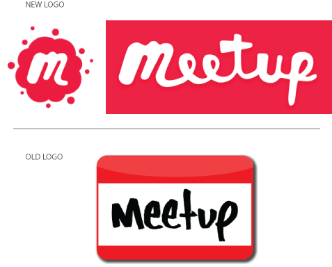
Meetup's new logo: Beyond the nametag
October 5th, 2016

Meetup.com, a straight-forwardly named website focused on group meetings, is just one member of the continuous cavalcade of social networking sites to undergo a logo design change. Surprisingly, there seems to be little uproar over this decision. Is this because Meetup.com is a “small fry” in comparison to titans like Twitter or Instagram – or did the users see the change in a positive light for once?
Meetup’s rebrand is part of its large-scale overhaul which modernizes its apps, features and image. Among other outdated “relics” in need of an update was the old logo, styled after a nametag. According to Jen Gergen, design director of branding identity at Meetup, this logo represented the awkwardness of meeting for the first time, rather than a sense of excitement and pleasure. "The moment we realized it had to go was when we realized that our logo actually represented the worst part of meeting up with new people," she explains. Additionally, it was difficult to work into an icon.
The new logos, on the other hand, aim to create a fun, quirky and casual feel. The icon version even comes with a nifty animation: a plethora of dots converging together into a single splatter to symbolize many people all coming together.
So, do you think Meetup succeeded in its mission to create a more friendly and personable face for its users? Or do you think that by ditching its iconic nametag, Meetup.com has sacrificed a bit of its own identity?
About the Author:
Daniil Stoenko is a professional writer and translator who produced a variety of articles for LogoBee’s Logo Design Blog over the years.


