Killed Expectations
December 2nd, 2015
![]()
Clients are often disappointed when designers fail to deliver the smart and witty logo design of their dreams... but the designer is not always at fault.
The above sample logo for a nonexistent company named “Killed Productions” has figured in many lists of the “coolest logos” around the internet, and for good reason. It’s smart, it’s short and it’s stylish, and you probably want a logo just like this one. Except, the name of your company is not “Killed Productions”, but, say… “Trevinson Technological Solutions”.
Can you see why that might be a bit of a problem?
Clients ordering custom logo design services often turn to the internet in their search of a “cool” logo. But while the internet is undoubtedly full of great logo examples, that’s not to say they are all suitable or applicable to your business. Googling “cool logos” shows you hundreds of sample logos with a very common theme: “What you read is what you see”.
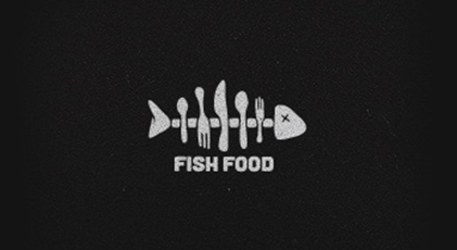
If the sample logo’s name is “Fish Food”, you see an image of a fish and table utensils.
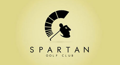
“Spartan Golf Club” – a Spartan and golf player.
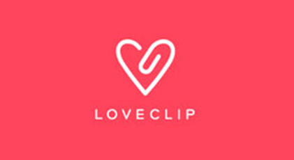
“Love Clip” – an image of a paper clip in the shape of heart.
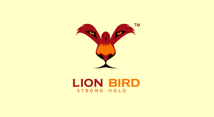
“Lion Bird” – a lion and a bird…
A common trend among clients is to ask for a similar logo for their company, failing to realize when that simply would not work. The logos in question may be expertly designed, but in the real world, clever themes and imagery cannot merely come into existence with a wave of a magic wand.
Suppose a client needs a logo for the aforementioned “Trevinson Technological Solutions”, a company specializing in creating software for the financial marketplace. As a suggestion to the designers, the client sends examples like the “Killed Productions” logo, expecting to see a similarly clever logo for his company. What the client does not realize is that a clever logo must be based on a meaningful company name. The name “Trevinson Technological Solutions” does not have any recognizable images associated with it, nor does the business field of developing software in a financial industry. The closest thing available is an image of a computer, but that is outdated, cliché and boring. And when the designers try to come up with some new imagery they feel may be appropriate, say a rocket or a lion, the client asks in confusion, “why the lion and why the rocket..?” The fact of the matter is that there is simply no way to create this kind of clever logo without some kind of imagery to base the cleverness on.
In some cases, this issue can be averted if the designer questions the client about their preferences before the design process has begun – the client may then point to a particular image of interest. Unfortunately, in many cases, a client will simply ask the designer to produce samples without much input on the client’s part.
In the same vein, when they’re not looking for a “clever image”, clients often want a short and stylish text-based logo, such as Sony’s… even if their own company name is, again, “Trevinson Technological Solutions”. No matter what, it is simply impossible to make three or four words look as compact and clean as one or two words. The designer ends up being blamed for not delivering a logo befitting the client’s expectations, but is it really the designers fault?
This is why the process of starting up a company should begin with a well thought-out naming process. Nevertheless, even when neither the company’s name nor field of business evoke any imagery, a good-quality logo is not impossible. Abstract graphics are the go-to solution in this case, and many of the world’s leading brands use them to great effect. This just goes to show that, in the end, not all companies can, or need to be “Killed Productions” – nor, for that matter, should they strive to be.
About the Author:
Pavel Rokhmanko
Senior Art Director / Owner at LogoBee since 2000


