Parallelism or plagiarism of logo design?
August 5th, 2015
The issue of plagiarism in logo design is one we frequently denounce. But could it be that sometimes the public may be slightly too hasty in accusing a logo creator of plagiarism?
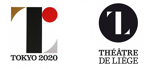
Highly successful designer Kenjiro Sano recently found himself under fire in relation to his design of the 2020 Tokyo Summer Olympics logo. The design had already been criticized for allegedly poor aesthetic qualities, but the decisive blow came when French designer Oliver Debie accused Sano of having plagiarized the logo that he created for the Théâtre du Liège. The two designs have since been described by some as “shockingly similar”, but Sano vehemently denies the accusations, calling them “baseless” in a recent press conference. Is he lying through his teeth, or is this whole affair just an unfortunate coincidence?
While the logos are undoubtedly similar to an uncanny extent, it should be noted that they both are graphically very simple – we have already mentioned in our blog that such plain geometric logos are the current trend. It is not easy for logo designers to create eye-catching and unique logos using only geometric shapes, and inevitably there exists a risk of unconsciously replicating someone else’s design without knowing about it firsthand.
The consequences of this are dramatically amplified when the logo is showcased to massive amounts of people around the world, as any Olympic logo is bound to be. The more people view a logo, the higher the risk that someone may find it similar to a logo of theirs – and the bigger the ensuing scandal, of course. To wit, Sano’s design had already been compared to yet another logo conceived by Spain’s Hey Studio, even though it bears significantly less resemblance to it than Debie’s logo. And doesn’t it seem like nearly every Olympic logo is doomed to either be very poorly made (such as the infamous London Olympics logo) or to be called a rip-off (such as the one made for the Rio 2016 Olympics, which was claimed to plagiarize the Telluride Foundation logo)?
We should also state that, for the reasons already mentioned above, it seems like a singularly stupid idea to willingly plagiarize someone else’s work while creating a logo for the Olympics – the worldwide exposure all but ensures you would get called out on it. And we would certainly hope that a famous designer like Mr. Sano realizes that as well as we do. Unless, of course, it was his plan all along that we would think that..? The world may never know.
About the Author:
Daniil Stoenko is a professional writer and translator who produced a variety of articles for LogoBee’s Logo Design Blog over the years.


