Why you should change the font you use for emails
August 27th, 2015
An article on the Bloomberg Business website recently discussed why we should change the font we use to write emails.
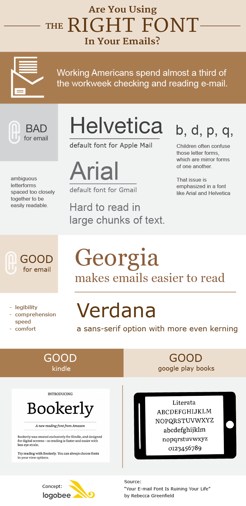
Many email programs default to plain, sans-serif fonts such as Arial and Helvetica. However, research has shown that these fonts are actually quite difficult to read in large chunks of text.
Apparently, Arial is hard to read in large chunks of text.
According to Bruno Maag of the type design company Dalton Maag, these fonts have ambiguous letterforms and are spaced too closely together to be easily readable.
Bruno Maag hates Helvetica.
"If you imagine b, d, p, and q, those are letter forms that all the children always mess up. They are mirror forms of one another," he said. "That feature is emphasized in a font like Arial, where the shapes are literally mirror forms."
It’s not just that they are hard to read either. Typographer Gerry Leonidas says these neutral-looking fonts are actually rather unneccessary these days – now that computer screens are very high resolution, we can afford to be a bit fancier with our type!
The Bloomberg article recommends a serif font such as Georgia, which has more “open” shapes, or for a sans-serif option, Verdana, which has more, and more even spacing between letters.
Georgia makes emails easier to read.
Verdana is a sans-serif option with more even kerning.
What do you think? Do you automatically use your email client’s default font, or have you changed it? If so, what have you changed it to, and why?


