Back to the start?
February 28th, 2012
Microsoft Windows 8’s simplistic logo ushers tough times for logo design companies.
![]()
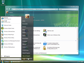
If you wish to receive a brief history of logo design fashion and graphic program capacities, all you need to do is to take a look at the gallery of Microsoft Windows’ logos.Every version of the operating system so far has had a logo more elaborate than the version preceding it. Windows 1 starts it off with its original simplistic window-shaped logo from 1985. The Windows 3 logo (1990) is created with use of the Blend tool and wave editing. The Windows 95 one includes a shadowing effect and color nuances created with Photoshop editing. In 2000, Windows ME’s logo includes gradients, and the 2009 Windows 7 logo goes even further, with gradient transparency. And now, in 2012, with almost endless possibilities for graphic design available thanks to dozens of programs developed to that effect, Microsoft suddenly hatches this logo that seems to have escaped right out of the year 1985.
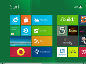
Windows 8’s logo is designed in the Metro style, characterized by straight lines and regular usage of uniformly colored squares and rectangles. It seems like the design reverts to the original window shape for the logo (just slightly modified). Even the color scale of the new design is similar to the one used in the original 1985 logo. Could it be that after having gotten progressively more and more complex for all these years, logo design now has nowhere to go but back to the start?
This regression to an old and simplistic style raises several problems for logo design companies when it comes to keeping up with today’s logo design trends. Oddly enough, even though all the clients want a modern logo that follows the new trends, they still tend to be disappointed with the final results. “I could have drawn this myself!” is the common reaction of a client upon receiving a bunch of squares instead of what they believe to be a “professional logo”. They have a point: Metro style just doesn’t seem memorable and striking enough to suit a new company trying to break out in the market. Sadly there is not much to do. Metro style does not leave much place to originality. The rectangle is a primitive shape and very little can be done around it. As a matter of fact, it would be fairly amazing if Microsoft were the first and only company to use this simplistic logo. Not that a multinational enterprise like them would worry much about copyright issues – they’re in a whole different league, beyond the legal reach of the average company.
Bottom line is, if Microsoft Windows’ logo reflects the logo design trends of today, then it looks like logo design companies trying to cater to small businesses might be in for a difficult period.
![]()
![]()
![]()
![]()
![]()
![]()
![]()
About the Author:
Daniil Stoenko is a professional writer and translator who produced a variety of articles for LogoBee’s Logo Design Blog over the years.


