2012 Olympics logo belongs in the scrap heap
November 24th, 2009
So, designers came up with a bad logo. And when I say bad, trust me, I mean it. I have seen 5 years old kids draw things more beautiful than this “work of art”.
And the Olympic Committee somehow approved of that logo design.
And now, people don’t like it. For some mysterious reason.
And all the officials have to say is, “This is surprising”. Way to go, geniuses. I personally find nothing “surprising” in that reaction. This logo is bad. Did I mention that already? Yes I did. But allow me to mention it again, for when something is so mind-bogglingly horrible, saying it is bad just once is certainly not enough.
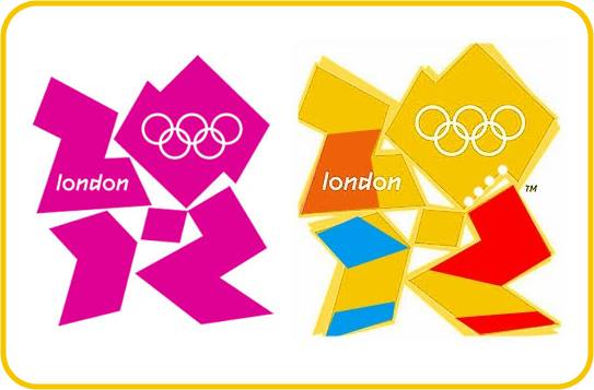
I mean, come on. What is this thing? I certainly not the only one for whom it took a good five minutes of staring at this logo just to figure out it reads “2012” – or more accurately, tries to do so. Because it certainly doesn’t look like it, not to the untrained eye. But I’m sure the fine minds at the Olympic Committee and the designers who came up with this abomination would disagree with me. I’m certain they could easily make out the numbers within that logo. Then again, I’m also certain they can make out numbers inside of abstract paintings, too.
This logo has been described as a "puerile mess", a swastika and a collection of beer mats – but none of those accurately describe it. I personally think it looks like… a collection of pieces of scrap metal. Bent and broken scrap metal. In one of its color variations, rusted scrap metal – and I will leave you the (dis)pleasure of figuring out what does the yellow “shading” stand for. This is very fitting, because this logo is like the equivalent of scrap metal in logo design. And just like with scrap metal, perhaps something could be done with it, but this would take a lot of work – something the designers who came up with this obviously didn’t appreciate. It probably took about as much time to design that logo as it would to go to your local scrap heap and collect a few rusty metal pieces. And now, on to the worst part: the Olympic Committee actually paid £400,000 for this. To continue our metaphor – they paid £400,000 for scrap metal. And then they wonder why the public is not happy.
Errors, errors, it’s all a tissue of errors. Certainly, there were more than a few people involved in this. If they paid £400,000 for it, surely there were quite a few designers “working” on this. You’d think one of them would have stood up and said, “Hey guys, what the heck have we created?” Same goes for the Olympic Committee: you’d think someone would have said, “What exactly have we bought? Don’t you think this logo looks lame?” What kind of a chain of coincidences did it take for a logo this horrible to see the light of the day? More coincidences then I’m willing to believe in. It’s as if an evil wizard bent on ruining the 2012 Olympics cast a spell to cloud the mind of everyone involving in the creation and commercialization of the logo, a spell which ultimately resulted in the creation of what is, hands down, one of the worst logos ever.


