Critique of the 2020 Tokyo Olympics' new logo design
August 26th, 2016
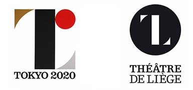
You may remember the story of the logo designed by Kenjiro Sano for the 2020 Olympics. The designer was accused of plagiarism by the Théâtre de Liège in Belgium. Sano denied the allegations, and I for one believe that the similarity of the two logos was coincidental, as the basic elements they use can be found in abundance in many types of art.

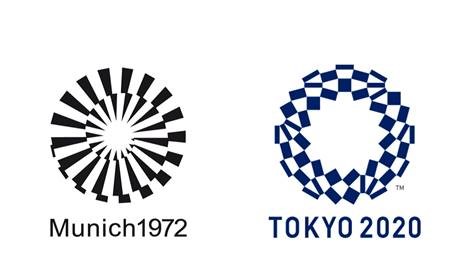
I would now like to bring your attention to the new, officially approved logo for the 2020 Tokyo Olympics. I feel like this concept is a little too similar to the logo of the 1972 Munich Olympics. In any case, though some people might prefer the new logo, in my opinion, the initial concept had more originality going for it. It looked unique in its own way and had more thought put into it.

Do you think the new official logo is similar to the one used for the Munich Olympics of 1972? Which one do you like better: Sano’s initial design or the new official one?


