Daredevil logo design, and more from Marvel Comics
October 16th, 2014
Superheroes are so hot right now.
Over the last few years, it seems as though a new big screen adaptation of a Marvel comic book favourite has been released every other week. As well as the Spiderman and Superman remakes, recent cinematic highlights have included Iron man 3, Captain America: The Winter Soldier and Guardians of the Galaxy. Further comic book releases are due to hit our screens in 2015.
But it’s not just the big screen that is enjoying Marvel-lous success. Off the back of the success of TV boxset series such as Breaking Bad, Homeland and The Wire, we are now entering a new era of serial comic book adaptations for the small screen. Gotham, a Batman spin-off charting the rise of Commissioner Gordon before Batman’s arrival in the city is due to hit screen very soon, and press coverage has started to ramp up for the launch of another superhero TV series in 2015: Daredevil.
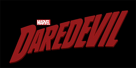
Marvel recently launched the logo design for the new Daredevil series (above). Online commentators have remarked on how refreshing it is to see a logo that is true to its comic book roots, rather than being ‘sexed up’ for a new televisual audience.
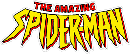
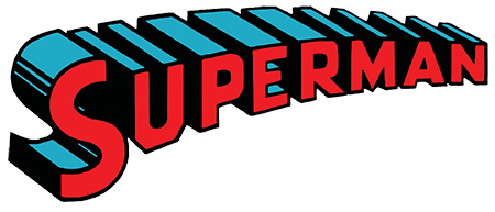
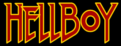
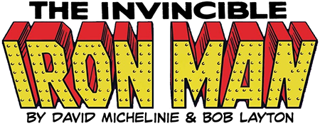
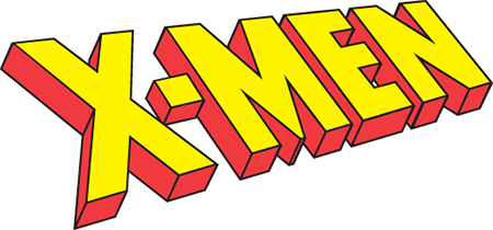
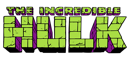
While I can’t call myself a comic book geek, I do really like the style of artwork used in graphic novels and comics – they’re simple, bold and evocative of the central characters. So, I did some research and found a few of my favourite comic book logos. Enjoy!
About the Author:
Although her primary niche is in scientific writing and editing, freelance writer Lisa Martin is also a creative type with an eye for design. She regularly works alongside graphic designers and as such has a keen interest in the development of logos and branding.


