Experimental typography
September 16th, 2013
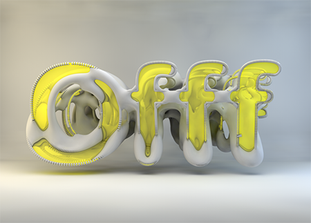
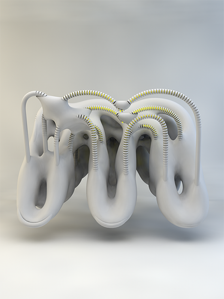
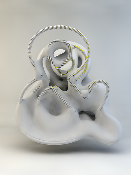
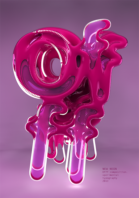
Creative networking website Behance exhibits the portfolios and works of artists all over the world – it’s a great place to browse for ideas, inspiration, and occasionally to be wowed. Just recently, on this site, the work of a Spanish artist going by the name Txaber caught our eye with his innovative and experimental approach to typography. Here are just a few examples of Txaber’s unique 3D sculpture-based letterforms, from a collection called “New Neon”.
Txaber has created a whole alphabet of these gray letterforms with splashes of neon. We love the way the machine-like characters seem to melt before you.
These examples, featuring the brand name of Spanish digital design festival Offf, really pop with color.
To see more of Txaber’s work, you can visit his website at http://txaber.net
About the Author:
Although her primary niche is in scientific writing and editing, freelance writer Lisa Martin is also a creative type with an eye for design. She regularly works alongside graphic designers and as such has a keen interest in the development of logos and branding.


