In with the old logo design?
June 2nd, 2016
![]()
New old logo
As you may have noticed, rebranding is a common topic in this blog. Updating a logo to a more modern one is a common practice – everyone wants to be up to date and with the flow. But The Co-operative Group, also known as the Co-op, chose to take the road less traveled by instead reinstating a previous logo of theirs – one that is almost 50 years old!
![]()
Logo designed in 2007
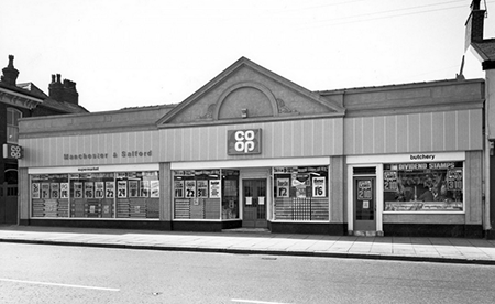
Founded 172 years ago, the Co-op is a venerable company and the largest consumers' co-operative in the UK, with over 8 million members. It should be expected that it would have gone through a few rebrands over the course of its long history. The previous logo was designed in 2007 and used the company’s full name – The Co-operative. However, after experiencing severe financial problems in 2013, the group decided to distance itself from its failings and hired North Design to establish a new corporate identity. Instead, the designers suggested bringing back an old one...
The 1960es logo is an interesting example of a text-based design where the text itself forms a graphic: a four-leaf clover, symbolic of good luck. North made very minor adjustments to the logo, which had originally been drawn by hand, but the difference between the original and the new version is minimal. Louis Mikolay, senior designer for North, says that “in older generations [the logo] evokes nostalgic memories of local shops and ‘divi’ [dividend] stamps, whilst to younger generations it suggests a modern brand of the future, ready to live and breathe in the digital world.”
This reaction highlights the most astonishing thing about the “new” logo: how modern it looks overall despite using a slightly out-of-style, nostalgic typeface. Simple and clever, it feels right at home in today’s design environment. Was this 1968 logo truly so ahead of its time… or perhaps have the trends in logo design really come full circle and back to the start?
About the Author:
Daniil Stoenko is a professional writer and translator who produced a variety of articles for LogoBee’s Logo Design Blog over the years.


