Is it logo evolution?
January 15th, 2011
All things in life change. Technology evolves. The same can be said about human mentality. Therefore it is really not surprising that art, and of course design, is undergoing constant changes.
The nowadays worldwide, famous organisation YMCA (Young Men’s Christian Organization) is a prime example of this rule, having gone through many logos over the course of its existence.
![]()
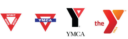
First YMCA Logo
The above logo has been created in 1891. You can see that the logo is simple and not particularly eyecatching. But the message conveyed in unmistakeable. The words on the triangle, “spirit, mind, body” are the three values the YMCA stands for. Healthy spirit, healthy mind, healthy body. The triangle symbolizes a kind of connection: to be healthy, it is necessary to take care of all three, such is the message conveyed by the logo.
![]()
YMCA logo created in 1917
This is the 1917 logo. Notice how the triangle remains in the background. The words “spirit, mind, body” disappear. Now that the company is well established, they are implicit, known to everyone without the need to even mention them. However, the triangle is still there, to remind the clients of this trinity.
![]()
YMCA Previous Logo
Take a look at the 1967 logo. The obligatory red triangle lives on, forming a branch of the stylized letter “Y”. In the vein of YMCA’s previous logos, this one is nothing too complex. However, the contrast between black and red, the sharp angles, are eyecatching enough. This logo grabs your attention immediately.
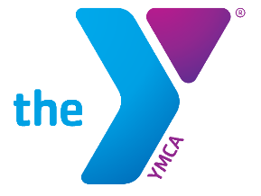
New YMCA Logo. Colors may vary.
Now here is the all new logo of the YMCA, introduced the 12th of July this year. The logo was apparently changed since the previous one “did not create enough attention” according to senior vice president and chief marketing officer of the YMCA in USA, Kate Coleman.
New design, new edgy shading... perhaps is this too much, no? The logo seems to abandon the standards of the YMCA and the spirit of the company. First of all, the signature triangle, while present, is not red, contrarily to all previous versions. It is also plain, contrarily to the previous ones, and thus ventures way too far from the original concept of three linked values. The plain triangle simply does not convey those links as the original outlined triangle did. The colors are dull. There is no eyecatching contrast between black and red. As marketing examiner Stacy Shilling adequately remarks, black and red are two of the strongest and boldest colors, and the new logo simply does not have that powerful feel the old one had. This letdown is felt as well in the smoother round edges, which just do not attract attention as the sharp ones did. Or the positioning of letters. The logo is not balanced, due to the massiveness of the “Y” compared to an awkwardly small “the”. And what’s with the small letters “ymca” on the side of the Y? They can be barely made out, but still stand out like a wart on the logo. The whole positioning is highly awkward overall.
All things in life change. Sometimes, they do not necessarily change for the better. One should always ask oneself: is it really evolution? Or perhaps... devolution?


