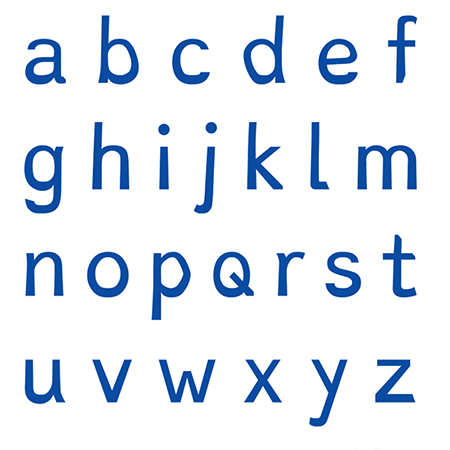
New font helps dyslexics to read
December 3rd, 2014
People with dylexia find reading more difficult than most – but not any more, thanks to a new font developed by a Dutch graphic designer.
Himself dyslexic, Christian Boer designed the ‘Dyslexie’ font back in 2008 as part of his final thesis project at the Utrecht Academy of Art. Since then, scientists have subjected the font to rigorous testing, and found that 84% of dyslexics studied could read the font faster than other standard typefaces.

Visually, Dyslexie has been called “the chubby-ankled cousin of Comic Sans”, which doesn’t sound too appealing from a design point of view! But with 77% of test subjects making fewer mistakes when reading the new font aloud, my guess is that this font will soon catch on, particularly in educational contexts.
The font ‘works’ by making individual letters subtley more different from each other than usual. Dyslexics often subconsciously switch or flip letters with similar shapes around – letters such as ‘p’ and ‘d’ or ‘v’ and ‘w’, for example. Dyslexie gives each character a ‘lower centre of gravity’ so that they are less likely to be confused.
You can find out more about how the font works by watching this short YouTube clip: http://www.youtube.com/watch?v=VLtYFcHx7ec.
You can also download the font for free from Christian’s website at: http://www.dyslexiefont.com/en/dyslexia-font/.
About the Author:
Although her primary niche is in scientific writing and editing, freelance writer Lisa Martin is also a creative type with an eye for design. She regularly works alongside graphic designers and as such has a keen interest in the development of logos and branding.


