New logo design for Lexmark
May 14th, 2015
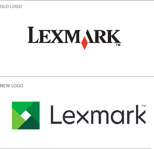
Lexmark, with its familiar logo with red diamond, is a brand that has been synonymous with printers and printing ever since its divestiture from computing giant IBM in 1991.
Since the early 1990s however, Lexmark’s business operations have become increasingly diverse, especially following a series of recent acquisitions including software development firm Perceptive Software in 2010; data capture company Brainware in 2012; Acuo Technologies, a developer of medical imaging document management software; and most recently, the announcement of the acquisition of Kofax for a cool $1 billion.
Given this expansion and shift in scope, it was time for a new Lexmark logo – out with the old-fashioned typeface and red diamond, hello to a cleaner, greener logo.
According to Lexmark’s president and CEO Paul Rooke, “the rebranding reflects both the evolution of the company, as well as our aspiration to be a leading global technology company.”
The move from red to green is a nod to longevity, a signal that – far from being an outdated company – Lexmark is moving with the times. The ‘aperture’ symbol gives a nod to the former red diamond, but also speaks of openness and expansion – to go with a new tag line, “open the poosibilities”.
About the Author:
Although her primary niche is in scientific writing and editing, freelance writer Lisa Martin is also a creative type with an eye for design. She regularly works alongside graphic designers and as such has a keen interest in the development of logos and branding.


