Home> Logo Design

Which logo design company to choose

June 29th, 2011

Beware!

In the last 5 years, we have seen a prolific growth in the Internet industry. Every conceivable field of business has seen the advantages the internet has to offer. One of these industries is logo design , which interestingly is considered to be the fastest growing in the world. You can now order any type of design from the comforts of your home or office and everything is presented to you in a timely manner.

With every moral, prosperous company out there - there are plenty just waiting to take advantage of you.

Read the rest of this entry »

Company name

June 22nd, 2011

You have developed your business idea, finished your market research, and now you need to decide on a name. The name must earn your potential customer's attention and trust. Start considering names in the beginning stages once you have determined your field of business. Use a serious name for a serious company. Use a fun name for creative company or a company that markets children.

Before you finalize your company's name, consider logo design concepts. They are difficult to capture on the first try. This is why a company should provide a designer with more information than just the company name. Consider the type of qualities you would like your company to portray. There are various logo design styles that portray different qualities. If you want to represent a very aggressive, high tech, corporate, and cutting-edge company, you should not come up with the name like 'Sloopy' or 'Scroochy'. Belive it or not, some of the names for clients in the past have been so inappropriate that it is not worth mentioning. The logo would look like Tinker Bell in a hockey Helmet!

Here are a few of the most important rules to consider when coming up with the best possible name:

Read the rest of this entry »

Selecting the concept

June 20th, 2011

Now the most important part is to get the concept for a logo. It is almost the same process as selecting the name. First you have to determine what your logo should say about your company. There are many different ways to represent a company.

•You may come up with an image related to a business like a house for a real estate company, or a car for a car dealership

•You could use just an abstract image representing the company`s philosophy. For example some kind of blocky image would suit a stable trustful company or even just a pyramid. A very dynamic image with orbits and swooshes, sparks, particles could be used for a very modern, young, high-tech company to represent electrical activities or just cutting edge meteoritic technology.

Read the rest of this entry »

What is a logo?

June 19th, 2011

A Logo is a design symbolizing ones organization. It is a design that is used by an organization for its letterhead, advertising material, and signs as an emblem by which the organization can easily be recognized, also called logotype. Logotype is a graphic representation or symbol of a company name, trademark, abbreviation, etc., often uniquely designed for ready recognition.

You may also think of a Logo as a simple visual mark to identify your company product or service. There are different types of signs and emblems easily recognized and associated with purposes. For example, crests are used to identify a country or family. There was a time when only big enough organizations could afford to make their own crest. They were in some cases very detailed drawing with many objects to enrich the crest. Cost was not an issue and more was considered better. Then flags were used due to their larger format. They were visible from the craft fields from long distances. Road signs were designed for informational purposes. They use such techniques as contrasting colors, simplified and yet stylish formats to identify and attract more attention and convey information.

Read the rest of this entry »

Nothing short of Logogate

June 8th, 2011

US Department of the Interior participates in an alarming new trend by crowdsourcing their logo design.
Can you hear the bells toll?
Today, the logo design profession has died. Alright, fine, it has not died yet per se, but a very severe blow has definitely been dealt to it. If not treated quickly, this blow could even turn out to be mortal.
What happened, exactly? Well, it appears that the US Department of the Interior has decided to crowdsource a logo design. We have already spoken of crowdsourcing in our blog previously, so you know why it’s dangerous, and you know why it’s rather immoral. You also know that, despite all this, it’s currently the most Read the rest of this entry »

BRICKS TO BRANDS

May 5th, 2011

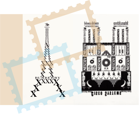
Risto-Jussi Isopahkala’s project “Logo Tourist” invites us to see famous landmarks in a whole new light.

logo designs


What if the Eiffel Tower was made not of metal bars, but of pieces shaped like Xerox’ iconic pixilated X-shaped logo, crowned with Budweiser Anheuser-Busch’s logo, with the A and the eagle? What if the Louvre was made of AIG, GAP, Caterpillar, Adidas logos?

What if someone built an entire city made of nothing but the symbols of the most successful brands?

Read the rest of this entry »

Free Logos Part 2

April 15th, 2011


Budget's too tight? Can't spend money on logo design? No problem! Just download one of these high quality logos, for free! Simply throw in some customization of your own, and you've got yourself a logo!

Each logo design was created by LogoBee designers using Adobe Illustrator. They are provided free of charge for you to download in scalable vector format (Adobe Illustrator CS3). Click the picture of a logo to download it.  For more freebies, check out LogoBee's first free logos collection here:

You are welcome to use these logos for your business or for personal use, but we have to ask you not to distribute them without permission.

Free logo designs


Logo #7: A series of hills with a church in the distance, a single star gently shining in the skies above. The outwards shape of the logo suggests a cross or perhaps a star. Peace and quiet are conveyed by the smooth colors and curvy lines of the logo, making it an ideal choice for a church.

Read the rest of this entry »

Google’s Doodle mystery

March 25th, 2011

Google are well known for their simple yet innovative products, all aimed at getting us to click on those ubiquitous monetized ads. Google’s best known product is undoubtedly their search engine. Used by an estimated 300 million people every day, the web page may look relatively simple, but uses some powerful search technology to deliver accurate results every time.
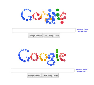
To keep the search page interesting, Google have built up something of a cult following by changing their “doodle”, or logo, almost every day. Halloween sees the G.O.O.G.L.E. bedecked with cobwebs and spiders, at Christmas time it’s flashing with fairy lights and glistening with snow. Sometimes, the doodle is just for fun. Thursday 7th September was one of those “miscellaneous” days, and yet on that day, the infamous logo sparked a Twitter frenzy and even made the news.
The logo appeared fragmented into balls of color that moved away from the user’s mouse pointer, only to settle again when you typed in the search bar. Web developers the world over scratched their heads in puzzlement – how did they do that? (http://www.youtube.com/watch?v=cuNNcdD6G9A)
Speculators have proposed that the atomized Google logo made use of a new technology called CSS3 (Cascading Style Sheet). Here, each ball of colour was in fact the element of a web page, coded to look circular instead of rectangular, and to move away from the cursor at any point other than the search bar. Clever, eh?

Read the rest of this entry »

Is it logo evolution?

January 15th, 2011

All things in life change. Technology evolves. The same can be said about human mentality. Therefore it is really not surprising that art, and of course design, is undergoing constant changes.
The nowadays worldwide, famous organisation YMCA (Young Men’s Christian Organization) is a prime example of this rule, having gone through many logos over the course of its existence.
Read the rest of this entry »

Jump in quality for Rio Olympics Logo

January 5th, 2011


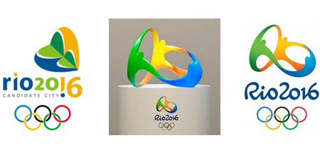
Rio Olympics logo designs
Back when it was announced that Rio de Janeiro would host the 2016 Olympic games, their candidate logo was quite frankly a bit strange. In fact, I don't quite understand what was it meant to represent. My best guess is that it's probably a weird hybrid between a heart and some kind of flower. Of course, it might also have been some kind of insect. Or two headless people hugging a reversed pine tree. Seriously, people should not be taking lessons from the London Olympics logo already discussed on this very blog. Non harmonious shapes, strange coloring and awkward positioning, Rio's candidate logo was not quite as bad as London's pile of scrap, but close up there.

Read the rest of this entry »

How To Create a Logo: Part 2 – The Concept

October 26th, 2010

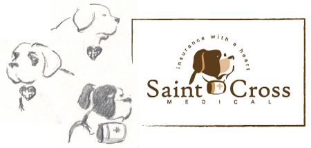
Saint Cross Medical logo design


In part 1 of this blog post series, we looked at the process of developing a brief for a graphic logo design project. Asking the right questions in order to build up a scope for the project is a crucial first step for the graphic designer, who needs to obtain enough information about the company, its values and the image it wishes to portray, to be able to develop a striking and instantly recognizable logo. There inevitably comes a point in this process however, where the designer needs to start actually designing, so what happens next? While each graphic designer has their own modus operandi, the design process generally starts with a good old fashioned sketch. Forget your Photoshops and your Illustrators for the time being, a graphic designer’s real best friend at this stage is a 2B pencil and a piece of paper.

Read the rest of this entry »

Mind the Gap

October 12th, 2010

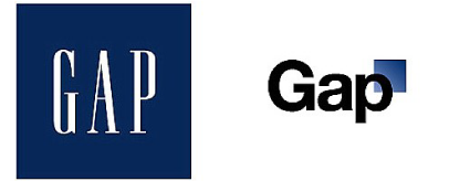
Gap logo designs


It’s always a risky move for any corporation to change its logo, and when internationally known clothing retailer Gap tried it recently, they soon learned that the customer is always right!

With industry experts suggesting that Gap was feeling out of touch with its client base in these times of economic crisis, a Gap spokesperson said that “after 20 years, it was time for change”. It was out with capital letters and a serif typeface, and in with Helvetica logotype and a blue gradient box design element – to the outcry of graphic designers and members of the public all over the world. 

Read the rest of this entry »

How To Create a Logo: Part 1 – The Brief

August 20th, 2010


The role of the graphic designer in creating a great logo for a particular company is a very important job – that logo will be used on the company’s advertising and marketing materials, on their website, on emails, on letterheads and stationery. It speaks volumes about the company’s ethos, its style, its purpose. A logo is a focus point for the eye, and a point of reference for the brain.

Read the rest of this entry »

Wise Business Decision Making: Outsourcing your Logo Design

June 12th, 2010

You've been in business for more than a couple of years. You've enjoyed moderate success through positive word of mouth and by delivering top-level quality of service, but your industry is becoming more and more competitive and the need for a more professional look is becoming imperative. Sound familiar? The truth is that in today's market even the best companies need to sell its image and brand in order to succeed. This is achieved primarily via the company logo as it is associated with all of the company media: letterhead, envelopes, websites, business cards, brochures and advertising campaigns.

Read the rest of this entry »

Changing the face of your company – is it worth it?

February 19th, 2010


new logo design
On the left, the current Spartans' logo. On the right, the proposed new one.


Changing a logo is not a simple task, and it’s rarely even useful.

There are monetary concerns, for one thing. Changing a logo means that you have to replace the old logo by the new one on all products related to your company. This is a small concern for internet firms whose logo only appears online, but for a team like the Michigan State University’s Spartans, it means replacing all the uniforms, souvenirs etc.

However, even more importantly, when you alter your logo, it’s the whole image of your company that you change.

Read the rest of this entry »