50 Logo Design Styles And Techniques
November 27th, 2013
There is no one true approach to logo design. A wide variety of design styles and techniques can be employed by designers in their efforts to create a memorable logo. In this article, we try to make an inventory of every different category a logo can fall into. You will notice that style, layout, form, technique and subject elements are all included. Logos typically fall into a combination of these categories - it is virtually impossible to see a logo fall into only one of them. For example, a logo can be a unique font with multicolored letters, a 3D graphic with gradients to spice it up, or an animal drawn in a childlike manner.
Some say that creativity consists in the ability to take several oft-used elements and to arrange them in a whole new way. This is certainly the case in logo design. Even though none of these categories individually is very original on its own, great logo designers will take a few of them and creatively combine them into something unique and outstanding.
1. Separate icon
![]()
2. Unique font
3. One letter graphic
![]()
4. Initials
![]()
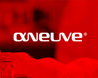
5. Integrated graphic and text
![]()
6. Crest
![]()
7. Seal
![]()
8. Text in shape
![]()
9. Cursive text
![]()
10. 3D graphics
![]()
11. Symmetry
![]()
12. Transparency
![]()
13. Gradient
![]()
14. Outline
![]()
15. Illustration
![]()
16. Basic shape
![]()
17. Negative space
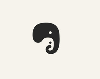
18. Cartoon character
![]()
19. Mascot
![]()
20. Stamp
![]()
21. Logo label
![]()
22. Pattern
![]()
23. Hidden object
![]()
24. Double meaning
![]()
25. Symbol
![]()
26. Ornament
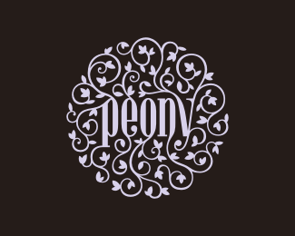
27. Victorian
![]()
28. Art deco
![]()
29. Vintage
![]()
30. Multicolored abstract
![]()
31. Industrial
![]()
32. Western
![]()
33. Elements collage
![]()
34. Multicolored letters
![]()
35. Black outline
![]()
36. Brushstroke
![]()
37. Ink and pen graphic
![]()
38. Lithography
![]()
39. Tribal art
![]()
40. Folk
![]()
41. Graffiti
![]()
42. Grunge
![]()
43. Childlike
![]()
44. Watercolors
![]()
45. Mosaic
![]()
46. Offset
![]()
47. Animal
![]()
48. Flags
![]()
49. Origami
![]()
50. Blended lines
![]()
If you have any suggestions for other logo design styles and techniques that we have not mentioned, you're welcome to leave a comment and tell us what you think!


