YouTube chooses metro design
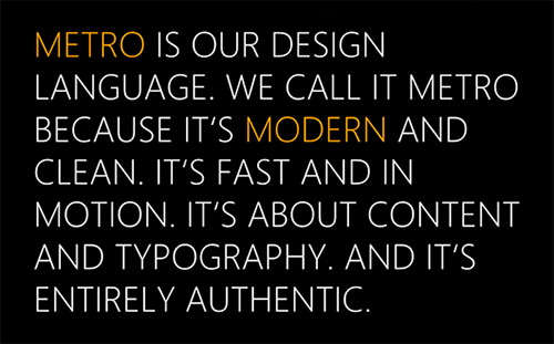
September 4th, 2013A new version of YouTube’s logo has started to appear on some of its social media profiles, including its Twitter and Facebook pages, and on the new versions of its Android and iOS apps. The design, a crisp, clean, flat red play button, is very much in the ‘metro’ style – popularized by Microsoft and perhaps best explained in Microsoft’s own words:
Although YouTube has said that the new logo will not replace the old one (below), the idea is apparently to help create a simpler identity that will work better as an icon.
![]()
Posted in: Branding & Marketing, Design, News,