What makes a great logo design
March 30th, 2012
1) The company’s name is the inspiration for a lot of great logos!
What do the logos of Apple, FireFox, Taco Bell, Shell, Puma all have in common?
![]()
All of these logos include an identifying object directly related to the name. This technique presents its own benefits and challenges. The benefits are obvious: it is very easy to identify the company name just by looking at the symbol and it makes the logo look clever. It also makes it memorable. The challenges come into play if you have a company name similar to that of one already on the market. How do you make your “apple” look different?
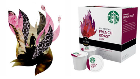
2) There are logos with a recognizable object not associated with the company name.
For instance, Playboy, Starbucks, Lacoste, Bacardi, Michelin, Peugeot...
![]()
These logos have an identifiable image not related directly to the name of their company. This is really not less effective than the previous way, and many successful companies use this technique. Some of those logos have a hidden meaning or a story behind them, but if you don’t know that story already, it is usually hard to connect the dots: why is there an alligator on a fashion garment, exactly? Others can be related to the enterprise’s field of business. The Michelin Man logo was a great success. Even though it has no story behind it, it does convey the feel of a company producing tires filled with air. Usually, it’s very difficult for a designer to come up with an identifiable image not connected to the company name without getting some kind of story or meaning behind the concept.