Home

JC Penney logo takes a step back

October 17th, 2013

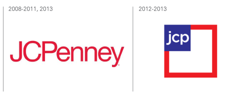
According to the Huff Post, “JCPenney wants you to forget that it hired an ex-Apple executive and tried to be ‘hip’”. After launching a brand new logo just two years ago – and following the dismissal of the CEO who commissioned it – US department store JCPenney has decided to revert back to its old one.

Read the rest of this entry »

Apple knocks Coca-Cola off top brand spot

October 16th, 2013

Technology firms Apple and Google are the most valuable brands on the planet, according to the results of a recent Interbrand report on the Best Global Brands.

Read the rest of this entry »

London Design Festival: 100% Norway

October 2nd, 2013

Started in 2003, the London Design Festival is an annual event that celebrates art, architecture, design and creativity in the city of London, England. Held over a period of 10 days each year, the festival is made up of more than 300 individual events that, according to London’s Mayor, Boris Johnson, provide “the most vivid possible proof that London in the hub of the creative industries in the world”.

Read the rest of this entry »

Graphic design, graphic style

September 27th, 2013

Meka Logo

Thibault Desiront, also known as Meka, is an artist, illustrator and graphic designer from Montreal, Canada. Heavily influenced by punk rock music, skateboarding and motorcycles, Meka’s work draws inspiration from the underground scene and is characterized by vibrant, retro-tinted graphic art. Featuring twisted, cartoon-like faces, bold graffiti style, and vivid color palettes, as well as striking monochromes, Meka’s art is reminiscent of graphic novels, comic books, and the painstakingly intricate tattoos of a Hell’s Angel.

Read the rest of this entry »

Meet Peter Saville, the UK’s greatest/worst graphic designer

September 23rd, 2013

According to 57-year old Peter Saville, the graphic design industry practices “mass mind control and triviality that enslaves people to consumption.” Not exactly the words you would expect to hear from the recent recipient of the London Design Medal, the most prestigious design award in the UK.

But then again, Peter Saville is a man of many contradictions.

Read the rest of this entry »

Getting more Bing for your buck

September 20th, 2013

When I search the internet, I use Google. ‘Googling’ has become such a common part of our lives that the term has even become a verb in the modern vernacular. Want to know what’s on at the cinema tonight? Don’t call the cinema – Google it. Need some information for your homework? Don’t go to the library – Google it. Want to know how many people have the same name as you – leave that telephone directory alone – just Google it!

So, when I read that Microsoft’s search engine, Bing, had launched a new logo, it reminded me that other search engines do in fact exist. But with Google so popular and so ingrained in our day-to-day lives, what would make anyone switch to Bing? Does, in fact, anyone use it?

Read the rest of this entry »

Experimental typography

September 16th, 2013

Creative networking website Behance exhibits the portfolios and works of artists all over the world – it’s a great place to browse for ideas, inspiration, and occasionally to be wowed. Just recently, on this site, the work of a Spanish artist going by the name Txaber caught our eye with his innovative and experimental approach to typography. Here are just a few examples of Txaber’s unique 3D sculpture-based letterforms, from a collection called “New Neon”.

Read the rest of this entry »

Mixed reviews for Colorado’s new brand identity

September 13th, 2013

A few weeks ago we reported on the innovative use of collaborative social media by the state of Colorado to create a new state brand identity. The idea was to take everyday Coloradans’ thoughts and feelings about their home state, and to use these to develop a logo that would represent Colorado on state documentation, tourism promotions, and in local business. You can read more about the project on our original blog post.

We can now reveal that the winning design has been announced.


Read the rest of this entry »

New Yahoo logo has been revealed

September 10th, 2013

So, here it is – the logo we’ve all been waiting for. After a month of being teased with a different logo design each day for thirty days, internet search engine and multimedia company Yahoo! finally puts us out of our misery. Drum roll please….


Read the rest of this entry »

Chermayeff & Geismar & Haviv

September 6th, 2013

There is an incredible amount of talent in the world of logo design, so in this blog post I’d like to take a few minutes to celebrate one of my favorite design agencies, other than LogoBee of course!

Chermayeff & Geismar & Haviv is a stalwart in the design and branding industry. Founded by Ivan Chermayeff and Tom Geismar in the late 1950s, and joined by third partner and designer Sagi Haviv in 2006, over the last five decades the company has worked with some of the biggest names on the planet. Their impressive client list includes the likes of Mobil, Xerox, the US Environmental Protection Agency, the Rockerfeller Center, NBC, Time Warner, Merck, National Geographic, and many, many more. To say these guys are in the major league is an understatement!

Read the rest of this entry »
Now anyone can be a graphic designer…almost

September 5th, 2013


When looking for images to use for your website or blog, where do you go? For the amateur website owner or those on a tight budget, a do-it-yourself approach is common – taking your own photos, or finding copyright-free images on websites like Flickr or Wikimedia Commons can be a great way to liven up your blog posts. Those with a few dollars to spend may purchase royalty-free, or license rights-managed images from a stock repository, but in all of these cases, you’re stuck with the image “as is” – it’s not easy (or always legal) to manipulate graphics to make them unique to your purpose.

Read the rest of this entry »

YouTube chooses metro design

September 4th, 2013

A new version of YouTube’s logo has started to appear on some of its social media profiles, including its Twitter and Facebook pages, and on the new versions of its Android and iOS apps. The design, a crisp, clean, flat red play button, is very much in the ‘metro’ style – popularized by Microsoft and perhaps best explained in Microsoft’s own words:

Although YouTube has said that the new logo will not replace the old one (below), the idea is apparently to help create a simpler identity that will work better as an icon.

Read the rest of this entry »

Yahoo! - logo update

August 30th, 2013

As some of you may know, Yahoo is in the process of replacing their old logo. Right now, the company is showcasing 30 different logo designs over 30 days, one logo every day. We are not sure how the selection process works, as we couldn't find any user voting feature on the site. The big reveal is scheduled for September 5th! There are no news on who designed the samples or who will be making the final decision.

Here at LogoBee, we've decided to experiment with a few ideas of our own. Here is a list of 6 logo samples designed by our team. Their styles vary from conservative to liberal. Personally, we believe a simple cleanup of the old logo (removing all the serif add-ons on the letters) would be a good choice for Yahoo.

Read the rest of this entry »

Mosïacultures 2013

August 29th, 2013

When I’m not indulging my interest in design by writing blog posts for LogoBee, the main ‘hat’ I wear is my ‘science communications hat’. I am currently working at a university in central England, where I write about the plant science research that is happening in the UK. Plants fascinate me – they are beautiful, vital, intricate and complex – but it’s not often that I get to write about them in anything other than a fundamental science capacity.

photo by Alain Charbonneau

So, I was excited to learn about the Mosaïcultures festival that is currently happening in Montréal until the end of September – it combines plants, science AND art from around the world! Read the rest of this entry »

New Brooklyn College President rejects phallic logo

August 21st, 2013


Businesses often decide on a change of image when a new leader takes the reins – out with the old and in with the new in more ways than one, so to speak. This was certainly true when Karen L. Gould became the new President of Brooklyn College, a higher education institution that forms part of the City University of New York.

According to sources, Gould, the first female President in the college’s 80-year history, felt that the former College logo ­– a silhouette of the campus’ imposing Georgian clocktower (see below left) – was “too phallic”.

Read the rest of this entry »