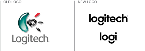
Logitechs squeaky clean new logo design look
August 14th, 2015
Though perhaps not a brand you’d immediately recognize on The Logo Quiz, Logitech is a computer peripherals company that has been around for over 35 years. Sat quietly sat in the backseat of its glitzier competitors, Logitech has been churning out useful, if not scintillatingly exciting devices since 1981.
Their products may not be as sexy as an Apple Watch – well, as sexy as an Apple anything, really – but that didn’t matter because everyone needs a mouse. In fact, if it hadn’t been for Logitech, we might all still be using the cursor keys to move around our screens.

But, as with all technology, things move fast and simply remodeling the mouse isn’t going to cut it anymore. Logitech can’t rest on its laurels. Time for a rebrand, then!

This branding video gives you an idea of the kind of look Logitech is going for: loud, trendy and cool https://youtu.be/7CO6PJ6IWFI.
A spokesperson for the company said, “Since 2013, Logitech has been working behind the scenes to reinvent the company, shaking things up culturally and through its product innovation. Its latest products are an outward expression of these changes, and moving forward Logitech is also bringing new life to its brand identity. Expect bold colors and simple designs to make their mark across Logitech.com, social media, on packaging and in-store displays over the coming year”.
So what are these new products? It’s not yet immediately clear, but we do know that for some of the more innovative, perhaps less “Logitech-like” products, a sub-brand is being developed called ‘Logi’. I look forward to seeing what they come up with!
What do you think of the new look?
About the Author:
Although her primary niche is in scientific writing and editing, freelance writer Lisa Martin is also a creative type with an eye for design. She regularly works alongside graphic designers and as such has a keen interest in the development of logos and branding.


