Madonna's Logo Drama
August 29th, 2014
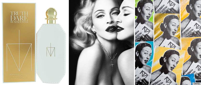
In 2012 Madonna launched her Truth or Dare fragrance. The logo for the perfume consisted of the letter M combined with a cross symbol. The logo made perfect sense considering it was made using the letter M and a religious cross – a symbol Madonna has often used throughout her career in her music videos and photographs.
The design, however, was not well received by everyone. It drew the ire of Australian artist, RJ Williams, who filed a lawsuit against Madonna, claiming she had infringed on his registered trademark for a similar design he had created.
While both logos bear a striking resemblance, did Madonna really copy his design? This example highlights the risks of very basic logo designs that are created using letters and/or simple geometric shapes. The simpler the design, the more likely another designer has thought of the same idea.
When creating a logo, the designer and client should always thrive to push boundaries, especially when working with basic shapes, to try to bring some uniqueness to their design. There is nothing more unfortunate than the thought of having an amazing logo but then seeing the same design somewhere else.


