Mesosphere: Dynamic logo design created by software
November 28th, 2013
If you’re a regular reader of this blog, you will know that I am not a graphic designer. In the course of my day job I work with designers on a regular basis, and I have an interest in design and branding, but to be honest, my own artistic creativity in the logo world is pretty limited.
So the many ways in which logo designers can continue to come up with inspiring, innovative designs never ceases to amaze me.
The subject of this blog post is a company called Mesosphere, or rather the creative genius behind the company’s new logo concept.
Mesophere is a start-up software company that creates applications to make access to cloud-computing services easier. No, I don’t really know what that means either. But apparently this area of software development is up and coming, which also means that it is a rather crowded marketplace.
With this in mind, Mesosphere needed to set themselves apart from their competitors, and one of the ways in which they have gone about this is to enlist the help of Brett Wickens at design agency Ammunition.
Ammunition has worked with some big name brands, including the ‘Beats by Dr Dre’ headphones, Adobe Creative Suite, United Airlines and Coca-Cola. Wickens also designed the iconic logo for the hit TV show, ‘The Sopranos’.
For Mesosphere’s logo, the onus was on creating a different kind of logo; something that moved away from clichéd images of clouds and building blocks, and instead to create a brand identity that would be remembered for its individuality.
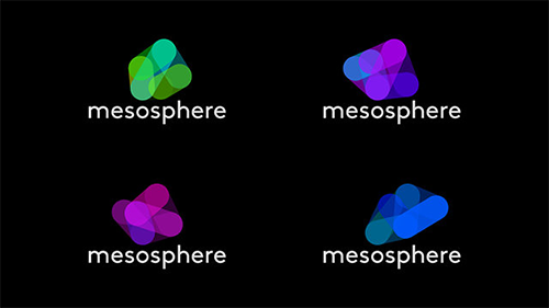
The solution? A logo for software, created by software.
The cool thing about Mesosphere’s new logo design is that it is not just one, still logo or even an animation based on many different drawings. Instead, it was created in code by a computer program with a dynamic algorithm that moves and morphs a shape based on the letter ‘m’ into different shapes. This video will explain far better than I can! http://vimeo.com/79442165.
According to Wickens, the logo represents the idea of interconnected networks, while tying in a link to the company’s name, as well as the “mysteriousness” of the physical mesosphere – the outer atmosphere of our planet.
The wordmark is also slightly unusual in that the top of each letter in the word ‘Mesophere’ is rounded. This is something that Wickens has capitalized on by using a modified version of the rounded font, Brown.
All in all, the effect is a hypnotizing animation which, despite its movement, still fulfils the brief of a great logo – it is interesting, usable in different formats, and above all, memorable.
I really love the idea that a logo can be designed using programming code! What do you think?
About the Author:
Although her primary niche is in scientific writing and editing, freelance writer Lisa Martin is also a creative type with an eye for design. She regularly works alongside graphic designers and as such has a keen interest in the development of logos and branding.


