Parental Advisory: This Logo Design is Cool
February 13th, 2015
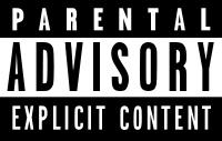
Parental advisory stickers were first introduced in the mid-1980s, after a group of parent campaigners in the US formed the Parents Music Resource Center. The group was outraged by, among others, a Prince song whose lyrics referenced masturbation.
Though not quite successful in getting their shortlist of songs banned completely, the group did pressure the US entertainment industry to release “clean” versions of songs with adult content, and to place a parental advisory notice on the front of music packaging. The current black and white incarnation of the logo remains unchanged since its launch in 1993.
But how much notice do we take of the logo now?
Dan Stubbs, news editor of the British music magazine NME, thinks that, from an artist’s perception, it’s almost a “badge of honour” to have your album stickered. He said: "It came out of this puritanical drive in America against rock and gangsta rap but completely backfired because bands would add in extra swearing just to get the sticker. Kids would want to buy that album because it had the label on and it made your CD seem cool. After all, isn't music partly about annoying your parents?"
About the Author:
Although her primary niche is in scientific writing and editing, freelance writer Lisa Martin is also a creative type with an eye for design. She regularly works alongside graphic designers and as such has a keen interest in the development of logos and branding.


