Home> Logo Design

How simple is too simple in logo design

January 26th, 2017

If you are a fan of tennis, you are probably following the Australian Open, and if so, you may have noticed that just about everyone, aside from Federer, seems to be wearing the same Nike outfit for whatever reason, right down to the sneakers! Not exactly convenient for telling one athlete from the other. How funny that the logo for the tournament should suffer from the exact same issue as well?


The updated logo of the Australian Open has made very few fans so far. According to a poll conducted by The Huffington Post Australia, 66 percent of respondents prefer the old logo over the new one. The overwhelming opinion is that the replacement simply fails to convey the essence of the tournament as well as the old logo – depicting a tennis player in the glare of the scorching Australian sun – did.

Read the rest of this entry »

Freudian slip-ups: the most sexually suggestive logos

December 20th, 2016

If father of psychoanalysis Sigmund Freud is to be believed, the human mind revolves mostly around sex. Looking at some of the logos on today’s list, it’s easy to see where he was coming from – no pun intended. None of them have been created for companies that deal in sexually explicit goods and services, yet they look like they might as well have been. Whether their designers’ sexual urges and frustrations drove them to subconsciously draw genitalia or whether the viewers’ perverted minds caused the misinterpretation of completely innocent designs matters little – one way or another, one they still prove Freud was right.


A word of warning: this article does contain some suggestive imagery and potentially inadequate language, and may be considered mildly NSFW depending on the standards of your workplace.


Read the rest of this entry »

Meetup's new logo: Beyond the nametag

October 5th, 2016


Read the rest of this entry »

Critique of the 2020 Tokyo Olympics' new logo design

August 26th, 2016

You may remember the story of the logo designed by Kenjiro Sano for the 2020 Olympics. The designer was accused of plagiarism by the Théâtre de Liège in Belgium. Sano denied the allegations, and I for one believe that the similarity of the two logos was coincidental, as the basic elements they use can be found in abundance in many types of art.

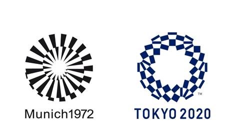
I would now like to bring your attention to the new, officially approved logo for the 2020 Tokyo Olympics. I feel like this concept is a little too similar to the logo of the 1972 Munich Olympics. In any case, though some people might prefer the new logo, in my opinion, the initial concept had more originality going for it. It looked unique in its own way and had more thought put into it.


Read the rest of this entry »

Netflix's New Logo: Double Trouble?

June 28th, 2016


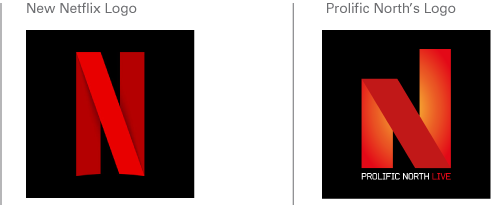
Seems like the lion’s share of the articles in our blog consists of a) companies replacing their iconic logos by more app -friendly ones (usually to the great displeasure of the public) and b) logo design plagiarism controversies. So today, as a special treat, we’re covering a case that merges both! Except the logo is not actually being replaced. And there’s not really a plagiarism controversy. Don’t worry, it will all become clear in a moment.

Read the rest of this entry »

In with the old logo design?

June 2nd, 2016

New old logo

As you may have noticed, rebranding is a common topic in this blog. Updating a logo to a more modern one is a common practice – everyone wants to be up to date and with the flow. But The Co-operative Group, also known as the Co-op, chose to take the road less traveled by instead reinstating a previous logo of theirs – one that is almost 50 years old!


Read the rest of this entry »

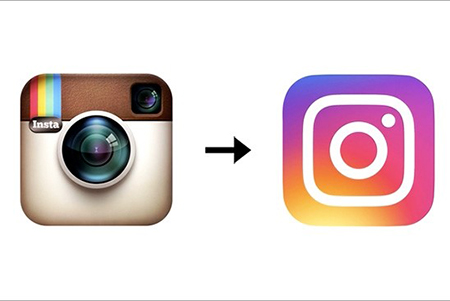
Insta Indignation

May 17th, 2016


A couple of months ago we have talked about how Larry the Twitter bird has been turned from a mascot-style logo into a flat monochrome shape over the years, and concluded that the simplification was all but inevitable in today’s design environment. Now, we have been proven right.

Read the rest of this entry »

Cooler and Controversial logo design

April 5th, 2016

Does Rhode Island’s new logo, created by acclaimed designer Milton Glaser, really pale before this replacement created by local designer in 10 minutes?


New Rhode Island logo created by Milton Glaser


Read the rest of this entry »

Double Entendre

March 29th, 2016

Tesla uses a logo with a double meaning to get around branding issue that prevented them from spelling out the word “sex” with the names of their new car models. Yes, really.


Read the rest of this entry »

Twitter logo transformation

March 23rd, 2016

The changes underwent by Twitter’s bird logo demonstrate the popularity of cleaner, simpler logos in this day and age.


The famous (or infamous, depending on how you look at it) social media site Twitter is celebrating its tenth birthday. Over its ten years of existence, Twitter has gone through a multitude of logos. We have discussed some of them before, but very little weight in the article was given to the main attraction: Larry the Twitter bird itself, which has undergone some interesting changes over the course of its existence. This article aims to correct the oversight.

Read the rest of this entry »

Magnolia Mania Logo

March 22nd, 2016

Palm Beach jeweler accuses actress Reese Witherspoon of plagiarizing her Magnolia Collection’s logo and using it for her clothing line Draper James.


Here we go again.

Like so many times before, the topic of the day is logo design plagiarism, or accusations thereof. This time, actress and producer Reese Witherspoon has come under fire for the logo of her clothing line, Draper James, which Jordann Weingartner, founder of the company I Love Jewelry, claims to be a copy of the logo she created for her Magnolia Collection.

The jeweler certainly does not mince her words, saying that Witherspoon “literally stole [her] magnolia”. While it’s hard to deny a resemblance between the two logos – both flower shapes with six petals and calligraphic initials in the center – Weingartner’s claims about the logo being her “artistic take on a magnolia” which “actually looks nothing like a magnolia” are slightly harder to swallow: viewed from above, these flowers can indeed have a very similar shape, thus the resemblance could potentially be coincidental. As we have said earlier on this blog, determining whether your logo has been plagiarized or simply inadvertently recreated by someone else is very difficult unless the logo in question has a very distinctive shape.

How ironic that the beautiful magnolia flower, often seen as a symbol of nobility and purity, would become the centerpiece of such a massive scandal.


About the Author:

Daniil Stoenko is a professional writer and translator who produced a variety of articles for LogoBee’s Logo Design Blog over the years.

Read the rest of this entry »
Cutest Cat Logos around the Internet

January 27th, 2016


Logo Source


Anyone who has spent any amount of time on the Internet at all knows a deep, fundamental truth: the true purpose of the Web is not information, communication, or even porn: it’s looking at adorable kitty cats and sharing them with all your friends… and acquaintances… and people you’ve “friended” for no good reason at all… and complete strangers… basically with everyone who loves adorable kitty cats, which of course means absolutely everyone on the planet.

Read the rest of this entry »
55 Olympic Games Logo Designs Since 1896

December 21st, 2015

This is complete collection of 55 Olympic games logos and graphics SINCE 1896.


55 olympic  games logos


Read the rest of this entry »

IKEA logo concept makes perfect sense

December 4th, 2015

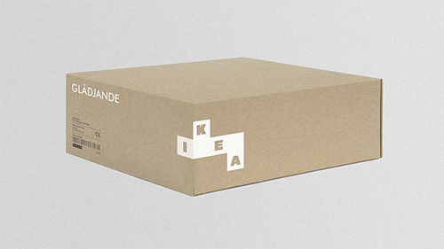
The logo of everyone’s favorite Swedish flat-packed furniture retailer has changed very little since 1967. Though once-upon-a-time black and white, and for a short time red and white, the familiar blue workmark inside a yellow oval has been IKEA’s trademark since 1983.


But Scottish design firm Freytag Anderson thought it was time for a rebrand. In a recent issue of Icon Magazine, the design firm showcased its ideas for a new Ikea branding concept – and you know what? It makes perfect sense.


Read the rest of this entry »

Killed Expectations

December 2nd, 2015


Clients are often disappointed when designers fail to deliver the smart and witty logo design of their dreams... but the designer is not always at fault.


The above sample logo for a nonexistent company named “Killed Productions” has figured in many lists of the “coolest logos” around the internet, and for good reason. It’s smart, it’s short and it’s stylish, and you probably want a logo just like this one. Except, the name of your company is not “Killed Productions”, but, say… “Trevinson Technological Solutions”.

Can you see why that might be a bit of a problem?

Read the rest of this entry »