Killed Expectations
December 2nd, 2015
![]()
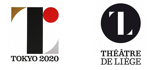
Clients are often disappointed when designers fail to deliver the smart and witty logo design of their dreams... but the designer is not always at fault.
The above sample logo for a nonexistent company named “Killed Productions” has figured in many lists of the “coolest logos” around the internet, and for good reason. It’s smart, it’s short and it’s stylish, and you probably want a logo just like this one. Except, the name of your company is not “Killed Productions”, but, say… “Trevinson Technological Solutions”.
Can you see why that might be a bit of a problem?
Read the rest of this entry »