Kobe Bryant NBA Logo Design Proposal
January 28th, 2020
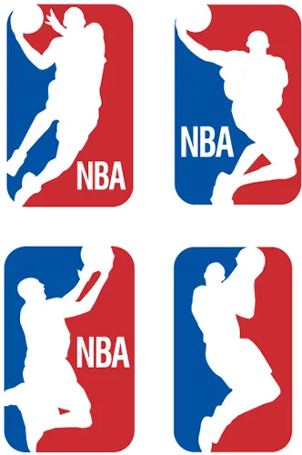
We were very touched by Kobe Bryant story. Our eyes were caught by an online petition to update the official NBA logo with an image of Kobe. Our designers were quick to create few mock-ups of what the logo may look like with images of Kobe`s silhouette in the logo.
One of the greatest players has rightfully earned his place in world`s history. He is well known and appreciated by many of us, even people far from sports knew his shining personality and smile.
Our deepest sympathy and condolences go to everyone who was touched by this tragic event.
Read the rest of this entry »Posted in: Design, Logo Design,