Home> News

Canada’s 150th birthday logo design courts controversy

December 11th, 2013

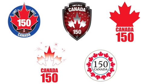
Happy birthday Canada! Well, almost. The independent state of Canada turns 150 years old in a few years’ time and Canadian Heritage has commissioned a new logo design to celebrate this momentous occasion. But how do you represent ‘Canada’ in a logo?

Like this, apparently.
Read the rest of this entry »

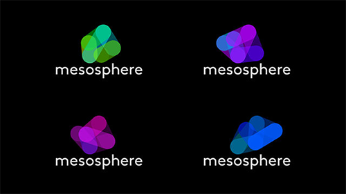
Mesosphere: Dynamic logo design created by software

November 28th, 2013

If you’re a regular reader of this blog, you will know that I am not a graphic designer. In the course of my day job I work with designers on a regular basis, and I have an interest in design and branding, but to be honest, my own artistic creativity in the logo world is pretty limited.

So the many ways in which logo designers can continue to come up with inspiring, innovative designs never ceases to amaze me.

The subject of this blog post is a company called Mesosphere, or rather the creative genius behind the company’s new logo concept.

Read the rest of this entry »

Philips reveals new logo design pixel by pixel

November 26th, 2013

Recently, companies revealing their new logo designs have started to try and do so in increasingly innovative ways.

Read the rest of this entry »

Lady Gaga’s logo design features on USA Today site

November 15th, 2013

Guest blogging is pretty common these days, but guest logo design? That’s a new one on me!

But that is exactly what Stephanie Germanotti – better known as Lady Gaga – did for the website of popular US newspaper USA Today on Monday.


Read the rest of this entry »

Racism in football logo design?

November 1st, 2013

Sports fans are known for their passionate tempers and fierce rivalries at games, but something off the pitch has got American football fans hot under the collar recently: the issue of what to call their team.

Read the rest of this entry »

Mixed reviews for Colorado’s new brand identity

September 13th, 2013

A few weeks ago we reported on the innovative use of collaborative social media by the state of Colorado to create a new state brand identity. The idea was to take everyday Coloradans’ thoughts and feelings about their home state, and to use these to develop a logo that would represent Colorado on state documentation, tourism promotions, and in local business. You can read more about the project on our original blog post.

We can now reveal that the winning design has been announced.


Read the rest of this entry »

New Yahoo logo has been revealed

September 10th, 2013

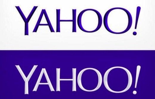
So, here it is – the logo we’ve all been waiting for. After a month of being teased with a different logo design each day for thirty days, internet search engine and multimedia company Yahoo! finally puts us out of our misery. Drum roll please….


Read the rest of this entry »

Now anyone can be a graphic designer…almost

September 5th, 2013


When looking for images to use for your website or blog, where do you go? For the amateur website owner or those on a tight budget, a do-it-yourself approach is common – taking your own photos, or finding copyright-free images on websites like Flickr or Wikimedia Commons can be a great way to liven up your blog posts. Those with a few dollars to spend may purchase royalty-free, or license rights-managed images from a stock repository, but in all of these cases, you’re stuck with the image “as is” – it’s not easy (or always legal) to manipulate graphics to make them unique to your purpose.

Read the rest of this entry »

YouTube chooses metro design

September 4th, 2013

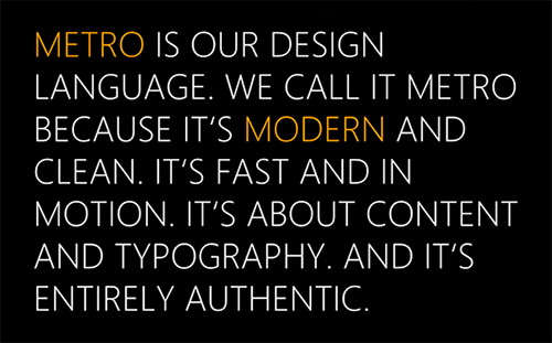
A new version of YouTube’s logo has started to appear on some of its social media profiles, including its Twitter and Facebook pages, and on the new versions of its Android and iOS apps. The design, a crisp, clean, flat red play button, is very much in the ‘metro’ style – popularized by Microsoft and perhaps best explained in Microsoft’s own words:

Although YouTube has said that the new logo will not replace the old one (below), the idea is apparently to help create a simpler identity that will work better as an icon.

Read the rest of this entry »

Yahoo! - logo update

August 30th, 2013

As some of you may know, Yahoo is in the process of replacing their old logo. Right now, the company is showcasing 30 different logo designs over 30 days, one logo every day. We are not sure how the selection process works, as we couldn't find any user voting feature on the site. The big reveal is scheduled for September 5th! There are no news on who designed the samples or who will be making the final decision.

Here at LogoBee, we've decided to experiment with a few ideas of our own. Here is a list of 6 logo samples designed by our team. Their styles vary from conservative to liberal. Personally, we believe a simple cleanup of the old logo (removing all the serif add-ons on the letters) would be a good choice for Yahoo.

Read the rest of this entry »

Yahoo! Showcases Thirty Logos in Thirty Days

August 14th, 2013

Internet search engine company Yahoo! has announced that it will soon be replacing its distinctive purple ‘exclamation point’ logo, but it will showcase a different logo every day before choosing the final design.

Yahoo! was founded back in 1995, right around the time that having access to the internet at home started to become popular with consumers. In the first year, the young start-up company experimented with some brightly colored designs (see below), which incorporated the signature exclamation point. As the brand became more popular – remember, this was before the days of Google, so Yahoo! quickly became one of the most popular internet search engines – it wasn’t too long before an established logo was introduced Read the rest of this entry »

Innovative Colorado closes in on a new brand identity

August 8th, 2013

Apple, Microsoft, McDonald’s, Pepsi – these are all successful brands that we know and recognize – but the state of Colorado as a brand?

In an innovative effort to boost tourism, attract new business and give Colorado a recognizable identity distinct from its neighboring states, Colorado’s governor John Hickenlooper launched a competition to design and develop a branding concept that could be used on official documents, tourism websites and by local businesses.

Read the rest of this entry »

New owner, new logo – Smoothie King smoothes it out

August 1st, 2013

You don’t have to be a fitness freak or health guru to realize that nutritional drinks are a hot trend right now. Energy drinks, protein shakes, lactose-free milk, power juices – nobody seems to drink plain water anymore!

Read the rest of this entry »

Hootie gets a makeover

July 24th, 2013

A travesty to feminism, or harmless fun? Love it or hate it, whatever your view, there’s no denying that the Hooters chain of restaurants is certainly iconic. The great-tasting chicken wings, the cold beer on tap, the warm and friendly atmosphere – oh yes, and the Hooters Girls with their skimpy orange shorts and tight white t-shirts!

Read the rest of this entry »

Pats go out with the old and in with the new

July 8th, 2013

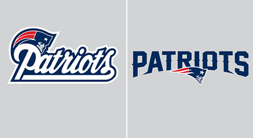
Fans of American Football team the New England Patriots will notice that something has changed about their team’s look recently – the logo.
The Patriots’ previous typographical logo was a swirling, old fashioned, blue-edged, white cursive font that has featured on team kit and merchandise since 1993 (see below left). This is now being dropped after 20 years in favor of a fresher, less traditional look for the 2013 season and beyond. The new logo will now feature a bolder, spikier, capitalized block font (below right), though will retain the blue color scheme to ensure some continuity, and while the font has become less curvy, the ‘Patriot’ logo – known to some as the ‘Flying Elvis’ – has become a little more rounded and now appears middle-bottom of the team’s name.

Read the rest of this entry »