Home> Design

Graphic design students eschew computers to recreate famous book covers

May 5th, 2015

While browsing the internet for inspiration about what to write about this week, I came across this brilliant art project by students of Shillington College.

Shillington is an international organisation providing design education courses. With campuses in New York, USA; London and Manchester in the UK, and Sydney and Melbourne in Australia, willing students can learn the basics of web or graphic design in a few months, and go on to advanced education or employment in the creative arts.

In an international challenge, Shillington students were assigned the task to recreate a book cover, but with one caveat – no computers allowed. The results are amazing!

Read the rest of this entry »

Tourisme Montreal highlights its accents in logo design rebrand

May 1st, 2015

I haven’t had the pleasure of visiting Montréal, home of LogoBee’s HQ, but a recent rebranding of the regional tourism board has made me want to visit!

Arguably, Tourisme Montréal’s previous logo –  ‘à la Montréal’ (see below) was a little dated and tired. When I first saw it, I was perplexed by the lipstick ‘kiss’ – it seemed rather feminine and thus confusing as to who the logo was meant to appeal to. I also thought the lipstick made the more difficult to read.


All that has changed with a fancy new restyle by agency LG2. The new Tourisme Montréal logo is bold, easy-to-read, gender neutral and very digital-friendly, as this video shows.

Read the rest of this entry »

An unfortunate Easter egg design hidden in Google Maps

April 29th, 2015

The cheeky little Android robot has been depicted in a wide variety of costumes and guises over the years, but recently got into trouble by appearing to take a pee on the Apple logo!

The naughty icon appeared embedded into the ‘map view’ of Google Maps, located at coordinates just south of the town of Rawalpindi in Pakistan.

Read the rest of this entry »

The Apple Watch

April 24th, 2015

We didn’t even know we needed one, but the launch of the Apple Watch this week is sure to take the world by storm. Market experts are predicting that, like many of Apple’s other products, it’s the creative design types who will be at the front of line to purchase one of these wrist-based mini-computers.

Read the rest of this entry »

Clinton logo design causes a Twitter storm

April 15th, 2015

Former First Lady Hillary Clinton announced that she would be running for the US Presidency again this year – and of course, every good marketing campaign needs a logo. Here’s Hillary’s:

Read the rest of this entry »

Avril Lavigne heads contest to design new logo

April 9th, 2015

I’m generally not a fan of logo design competitions – they always seem like such a good idea; a way to engage your target market and perhaps find some as-yet undiscovered (and therefore cheap!) creative genius to help sell your brand.

In reality however, they can be a bit of a waste of time. For businesses who are serious about getting their branding and identity “right”, I’d always advise to hire a recommended and reputable designer or agency – someone who really knows what they are doing.

"Avril Lavigne 2013" by Glenn Francis - Own work. Licensed under GFDL via Wikimedia Commons 

Read the rest of this entry »

Brands with Heart: new font collection with

March 12th, 2015

How do you convey to your customers that yours is a company that cares? International typeface company Monotype thinks it has the answer – with a font.

Monotype, and global branding firm Lippincott, worked together on a brief from Southwestern Airlines to develop a custom typeface and new brand identity. Southwestern was keen to convey the idea of “a maverick spirit and a passion for serving others”, and how better to do this than to somehow capture the essence of its warm, hospitable employees?

Read the rest of this entry »

Air Jordan jumping through hoops in copyright infringement claim

March 3rd, 2015

In 1984, sports photographer Jacobus Rentmeester took a series of photographs for a pre-Olympics feature published in LIFE Magazine. The series depicted the iconic basketball player Michael Jordan as he approached the net for a slam dunk.

Read the rest of this entry »

BIC Universal: handwriting for all?

February 27th, 2015

The brand name Bic is almost synonymous with its most famous invention: the humble ballpoint pen. Everyone has at least one Bic, everyone uses Bics, and while there are several variations on a theme, the standard Bic ballpoint is pretty much universal.

So if there’s a universal pen, is there is a universal handwriting? That’s a question Bic is trying to answer with its innovative ‘Bic Universal’ project.

Read the rest of this entry »

Parental Advisory: This Logo Design is Cool

February 13th, 2015

Parental advisory stickers were first introduced in the mid-1980s, after a group of parent campaigners in the US formed the Parents Music Resource Center. The group was outraged by, among others, a Prince song whose lyrics referenced masturbation.

Though not quite successful in getting their shortlist of songs banned completely, the group did pressure the US entertainment industry to release “clean” versions of songs with adult content, and to place a parental advisory notice on the front of music packaging. The current black and white incarnation of the logo remains unchanged since its launch in 1993.

Read the rest of this entry »

5 New UNESCO Cities of Design

December 8th, 2014

Helsinki, one of the new UNESCO Cities of Design. Image by Harri Timonen, via Flickr (CC-BY 2.0)


Santa Fe (Mexico), Buenos Aires (Argentina), Kobe and Nagoya (Japan), Montréal (Canada), Seoul (Korea), Shenzhen, Shanghai and Beijing (China), Berlin (Germany), Saint-Etienne (France) and Graz (Austria). What do these cities all have in common?

They are the only 12 countries in the world – until now – to have been awarded the coveted ‘UNESCO City of Design’ status.

Read the rest of this entry »

New font helps dyslexics to read

December 3rd, 2014

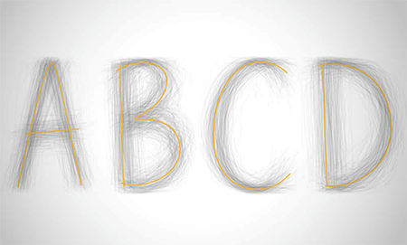
People with dylexia find reading more difficult than most – but not any more, thanks to a new font developed by a Dutch graphic designer.

Himself dyslexic, Christian Boer designed the ‘Dyslexie’ font back in 2008 as part of his final thesis project at the Utrecht Academy of Art. Since then, scientists have subjected the font to rigorous testing, and found that 84% of dyslexics studied could read the font faster than other standard typefaces.

Visually, Dyslexie has been called “the chubby-ankled cousin of Comic Sans”, which doesn’t sound too appealing from a design point of view! But with 77% of test subjects making fewer mistakes when reading the new font aloud, my guess is that this font will soon catch on, particularly in educational contexts.

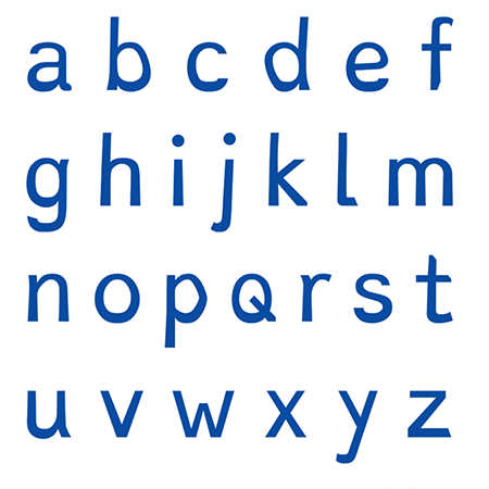
The font ‘works’ by making individual letters subtley more different from each other than usual. Dyslexics often subconsciously switch or flip letters with similar shapes around – letters such as ‘p’ and ‘d’ or ‘v’ and ‘w’, for example. Dyslexie gives each character a ‘lower centre of gravity’ so that they are less likely to be confused.

You can find out more about how the font works by watching this short YouTube clip: http://www.youtube.com/watch?v=VLtYFcHx7ec.

You can also download the font for free from Christian’s website at: http://www.dyslexiefont.com/en/dyslexia-font/.


About the Author:

Although her primary niche is in scientific writing and editing, freelance writer Lisa Martin is also a creative type with an eye for design. She regularly works alongside graphic designers and as such has a keen interest in the development of logos and branding.

Read the rest of this entry »

Let Books be Books: The beginning of the end for gender-marketed children

November 27th, 2014

British parents are leading a campaign to rid our bookshelves of children’s fiction specifically targeted either to boys or to girls.

Read the rest of this entry »

The Sony International Logotype Design Contest of 1981

November 25th, 2014

You’d expect a large consumer brand at the top of its game to have a huge branding and advertising budget. But back in 1981 – the heyday of the Sony Walkman – global electronics firm Sony decided to hand over a planned logo redesign to its customers.

But it turned out that crowdsourcing a logo was a really bad idea.

Read the rest of this entry »

Tomato sauce for Pizza Hut

November 24th, 2014

Inspired by the success of the recent rebranding of Taco Bell, now it’s Pizza Hut’s turn to get a new look.

Though the essence of the brand – the sloping, brush-stroked script and red ‘hut’ roof – will not change, the new logo is flatter, more one-dimensional and features a simpler colour palette. The new background to the red and white logo is inspired by a swirl of tomato sauce on a pizza base.

Read the rest of this entry »