Home> Logo Design

50 Logo Design Styles And Techniques

November 27th, 2013

There is no one true approach to logo design. A wide variety of design styles and techniques can be employed by designers in their efforts to create a memorable logo. In this article, we try to make an inventory of every different category a logo can fall into. You will notice that style, layout, form, technique and subject elements are all included. Logos typically fall into a combination of these categories - it is virtually impossible to see a logo fall into only one of them. For example, a logo can be a unique font with multicolored letters, a 3D graphic with gradients to spice it up, or an animal drawn in a childlike manner.

Some say that creativity consists in the ability to take several oft-used elements and to arrange them in a whole new way. This is certainly the case in logo design. Even though none of these categories individually is very original on its own, great logo designers will take a few of them and creatively combine them into something unique and outstanding.

1. Separate icon

view source

Read the rest of this entry »

A short history of Twitter’s logo design

November 19th, 2013

Social networking and ‘microblogging’ site Twitter has been around for just 7 years, and when it was launched many questioned whether it would take off given the huge popularity of Facebook.

Yet Twitter has become a social revolution. Via the main website, and various apps and clients, Twitter has over 500 million registered accounts and handled an estimated 1.6 billion search queries in 2012.

Read the rest of this entry »

Logo Design in NYC – Dreamers Ink Aesthetics

November 5th, 2013

Dreamers Ink Aesthetics, recently rebranded as DIA, could just be the epitome of New York City cool.

This Manhattan-based design agency, located in the trendy Little Italy district, has worked with some of the biggest names in the biz. Clients have included Google, Nissan, Nike, Nokia, Revlon, Kraft and many more recognizable brands.

Read the rest of this entry »

New LogoBee Logo Design and Website Navigation

October 25th, 2013

The time has come to kick it up a notch. After our successful logo update, we have moved on to upgrading our website itself. Along with the new logo came a new header and an updated navigation system. It is much more clean and intuitive than the previous one was. Lots of plans are on the way for the rest of the website as well! Stay tuned.

Read the rest of this entry »

New Yahoo logo has been revealed

September 10th, 2013

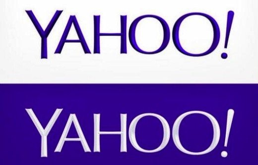
So, here it is – the logo we’ve all been waiting for. After a month of being teased with a different logo design each day for thirty days, internet search engine and multimedia company Yahoo! finally puts us out of our misery. Drum roll please….


Read the rest of this entry »

Chermayeff & Geismar & Haviv

September 6th, 2013

There is an incredible amount of talent in the world of logo design, so in this blog post I’d like to take a few minutes to celebrate one of my favorite design agencies, other than LogoBee of course!

Chermayeff & Geismar & Haviv is a stalwart in the design and branding industry. Founded by Ivan Chermayeff and Tom Geismar in the late 1950s, and joined by third partner and designer Sagi Haviv in 2006, over the last five decades the company has worked with some of the biggest names on the planet. Their impressive client list includes the likes of Mobil, Xerox, the US Environmental Protection Agency, the Rockerfeller Center, NBC, Time Warner, Merck, National Geographic, and many, many more. To say these guys are in the major league is an understatement!

Read the rest of this entry »

Yahoo! - logo update

August 30th, 2013

As some of you may know, Yahoo is in the process of replacing their old logo. Right now, the company is showcasing 30 different logo designs over 30 days, one logo every day. We are not sure how the selection process works, as we couldn't find any user voting feature on the site. The big reveal is scheduled for September 5th! There are no news on who designed the samples or who will be making the final decision.

Here at LogoBee, we've decided to experiment with a few ideas of our own. Here is a list of 6 logo samples designed by our team. Their styles vary from conservative to liberal. Personally, we believe a simple cleanup of the old logo (removing all the serif add-ons on the letters) would be a good choice for Yahoo.

Read the rest of this entry »

New Brooklyn College President rejects phallic logo

August 21st, 2013


Businesses often decide on a change of image when a new leader takes the reins – out with the old and in with the new in more ways than one, so to speak. This was certainly true when Karen L. Gould became the new President of Brooklyn College, a higher education institution that forms part of the City University of New York.

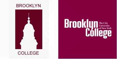
According to sources, Gould, the first female President in the college’s 80-year history, felt that the former College logo ­– a silhouette of the campus’ imposing Georgian clocktower (see below left) – was “too phallic”.

Read the rest of this entry »

Yahoo! Showcases Thirty Logos in Thirty Days

August 14th, 2013

Internet search engine company Yahoo! has announced that it will soon be replacing its distinctive purple ‘exclamation point’ logo, but it will showcase a different logo every day before choosing the final design.

Yahoo! was founded back in 1995, right around the time that having access to the internet at home started to become popular with consumers. In the first year, the young start-up company experimented with some brightly colored designs (see below), which incorporated the signature exclamation point. As the brand became more popular – remember, this was before the days of Google, so Yahoo! quickly became one of the most popular internet search engines – it wasn’t too long before an established logo was introduced Read the rest of this entry »

Innovative Colorado closes in on a new brand identity

August 8th, 2013

Apple, Microsoft, McDonald’s, Pepsi – these are all successful brands that we know and recognize – but the state of Colorado as a brand?

In an innovative effort to boost tourism, attract new business and give Colorado a recognizable identity distinct from its neighboring states, Colorado’s governor John Hickenlooper launched a competition to design and develop a branding concept that could be used on official documents, tourism websites and by local businesses.

Read the rest of this entry »

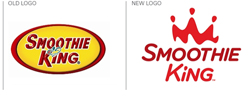
New owner, new logo – Smoothie King smoothes it out

August 1st, 2013

You don’t have to be a fitness freak or health guru to realize that nutritional drinks are a hot trend right now. Energy drinks, protein shakes, lactose-free milk, power juices – nobody seems to drink plain water anymore!

Read the rest of this entry »

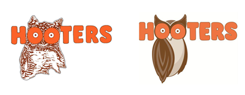
Hootie gets a makeover

July 24th, 2013

A travesty to feminism, or harmless fun? Love it or hate it, whatever your view, there’s no denying that the Hooters chain of restaurants is certainly iconic. The great-tasting chicken wings, the cold beer on tap, the warm and friendly atmosphere – oh yes, and the Hooters Girls with their skimpy orange shorts and tight white t-shirts!

Read the rest of this entry »

Pats go out with the old and in with the new

July 8th, 2013

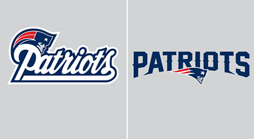
Fans of American Football team the New England Patriots will notice that something has changed about their team’s look recently – the logo.
The Patriots’ previous typographical logo was a swirling, old fashioned, blue-edged, white cursive font that has featured on team kit and merchandise since 1993 (see below left). This is now being dropped after 20 years in favor of a fresher, less traditional look for the 2013 season and beyond. The new logo will now feature a bolder, spikier, capitalized block font (below right), though will retain the blue color scheme to ensure some continuity, and while the font has become less curvy, the ‘Patriot’ logo – known to some as the ‘Flying Elvis’ – has become a little more rounded and now appears middle-bottom of the team’s name.

Read the rest of this entry »

This logo has been confirmed to be Motorola Mobility's new logo design

July 1st, 2013

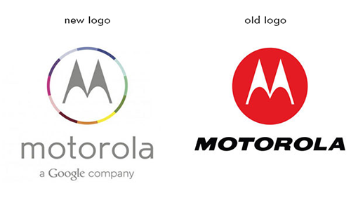
Ever since Google bought the company for $12.5 billion, Motorola Mobility has gone though many ups and downs. Although, the most recent development is the most noticeable and is getting people talking.

It was confirmed that Motorola is leaving behind the simple red circle for something with more color variety. As you may notice from the image, the new logo boasts a multicolored circle with Motorola's signature M inside. I guess the company's web department is a little late, because the new design isn’t on its website yet. The font was altered as well. It used to be all capital letters and italicized. Now, it’s lowercase and using thinner lines. In addition, the logo now bears a tagline: “a Google company”. It must have been Google’s idea to add it in order to show who’s in charge now.

Read the rest of this entry »

The Three Elements to a Solid Logo Design Plan

May 24th, 2013

By: Deborah Sweeney, CEO of MyCorporation.com

Nearly every small business owner knows how to plan – one of the first steps towards starting your own business is drafting a business plan. But few actually use that skill for anything beyond organizing their workday, or writing a proposal. Jobs like designing a logo really do benefit when the organic, creative process is focused with a plan. But since this is handled a little bit differently than that of a traditional business plan, what elements should be incorporated into a design plan?

Read the rest of this entry »